ggplot2 is a powerful data visualization package in R that allows you to create complex and aesthetically pleasing visualizations using a simple and consistent syntax. This course aims to provide a detailed guide to ggplot2, from basic concepts to advanced techniques, along with hands-on practice to help you master this versatile package.
Import libraries
── Attaching core tidyverse packages ──────────────────────── tidyverse 2.0.0 ──
✔ dplyr     1.1.4     ✔ readr     2.1.5
✔ forcats   1.0.0     ✔ stringr   1.5.1
✔ ggplot2   3.5.1     ✔ tibble    3.2.1
✔ lubridate 1.9.3     ✔ tidyr     1.3.1
✔ purrr     1.0.2
── Conflicts ────────────────────────────────────────── tidyverse_conflicts() ──
✖ dplyr::filter() masks stats::filter()
✖ dplyr::lag()    masks stats::lag()
ℹ Use the conflicted package (<http://conflicted.r-lib.org/>) to force all conflicts to become errors
Key components
Every ggplot2 plot has three key components:
data ,
A set of aesthetic mappings between variables in the data and visual properties, and
At least one layer which describes how to render each observation. Layers are usually created with a geom function.
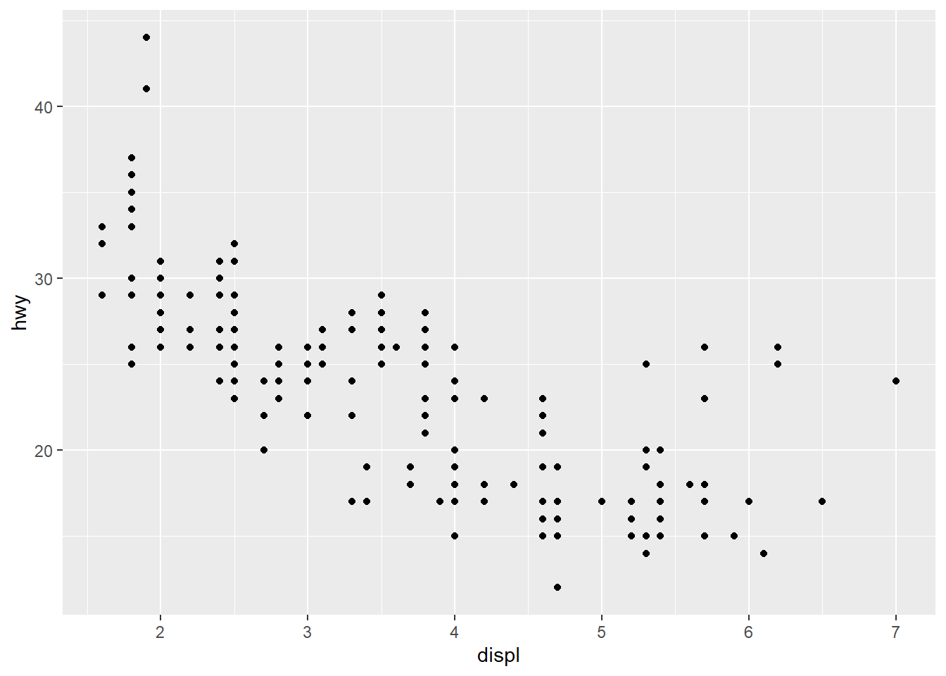
Here's a simple example:
ggplot (mpg, aes (x = displ, y = hwy)) + geom_point ()
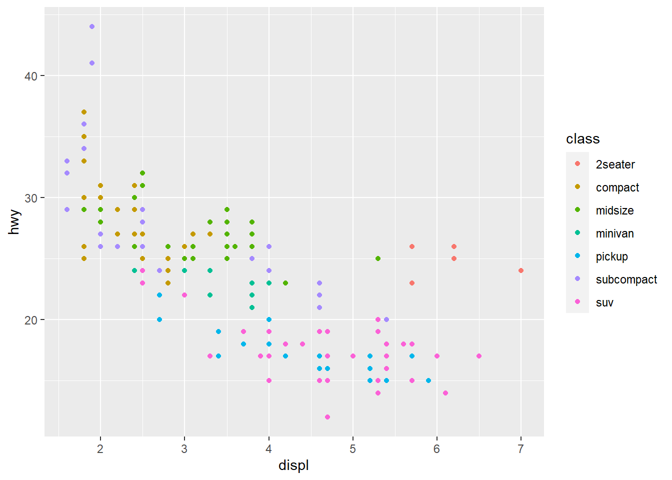
Color, size, shape and other aesthetic attributes
aes(displ, hwy, colour = class)
aes(displ, hwy, shape = drv)
aes(displ, hwy, size = cyl)
ggplot (mpg, aes (displ, hwy, colour = class)) + geom_point ()
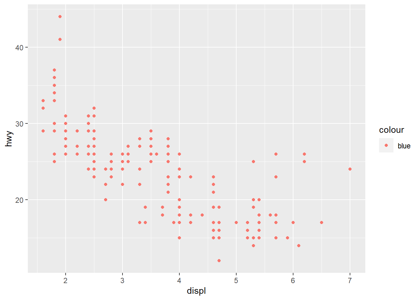
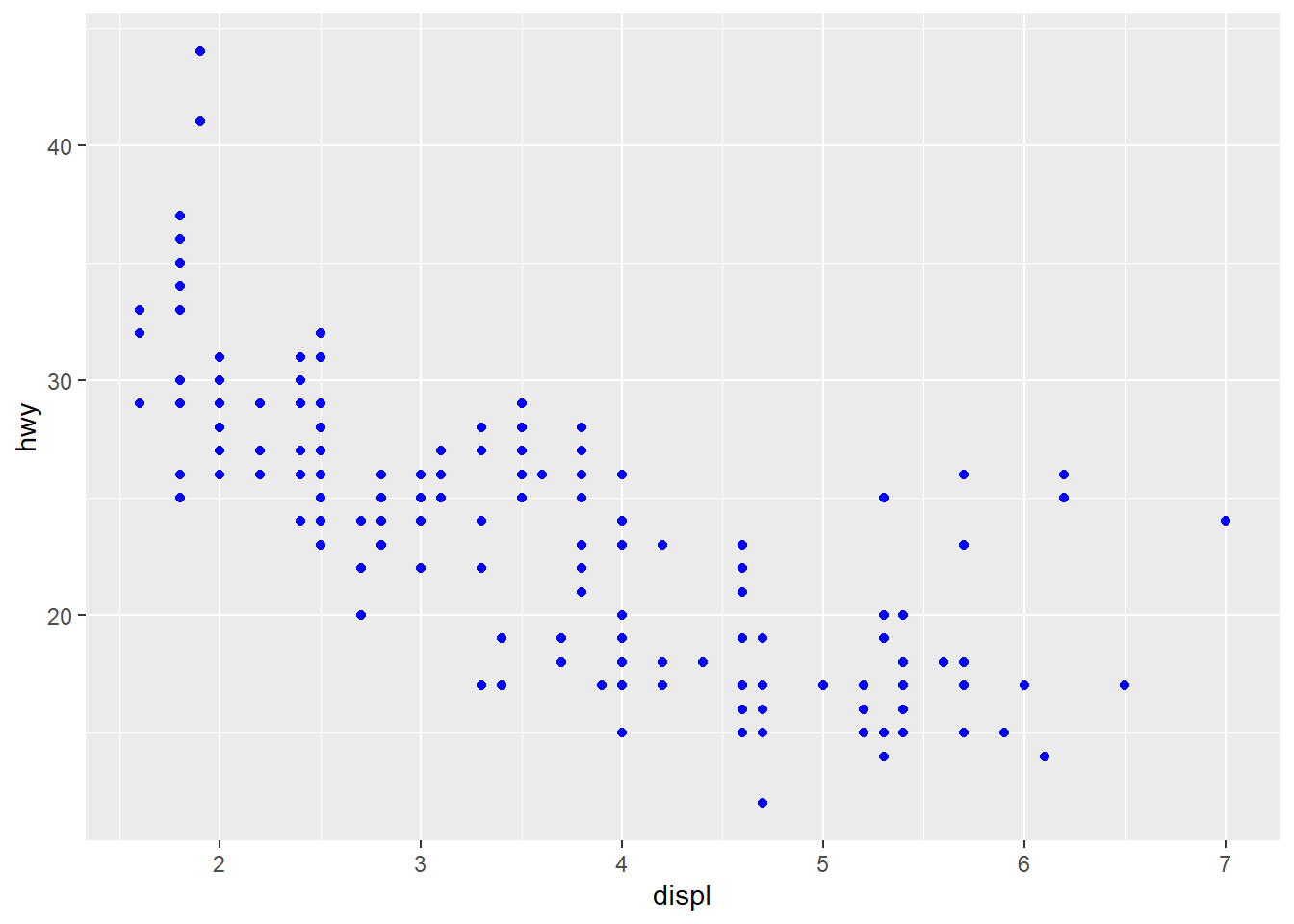
ggplot (mpg, aes (displ, hwy)) + geom_point (aes (colour = "blue" ))ggplot (mpg, aes (displ, hwy)) + geom_point (colour = "blue" )
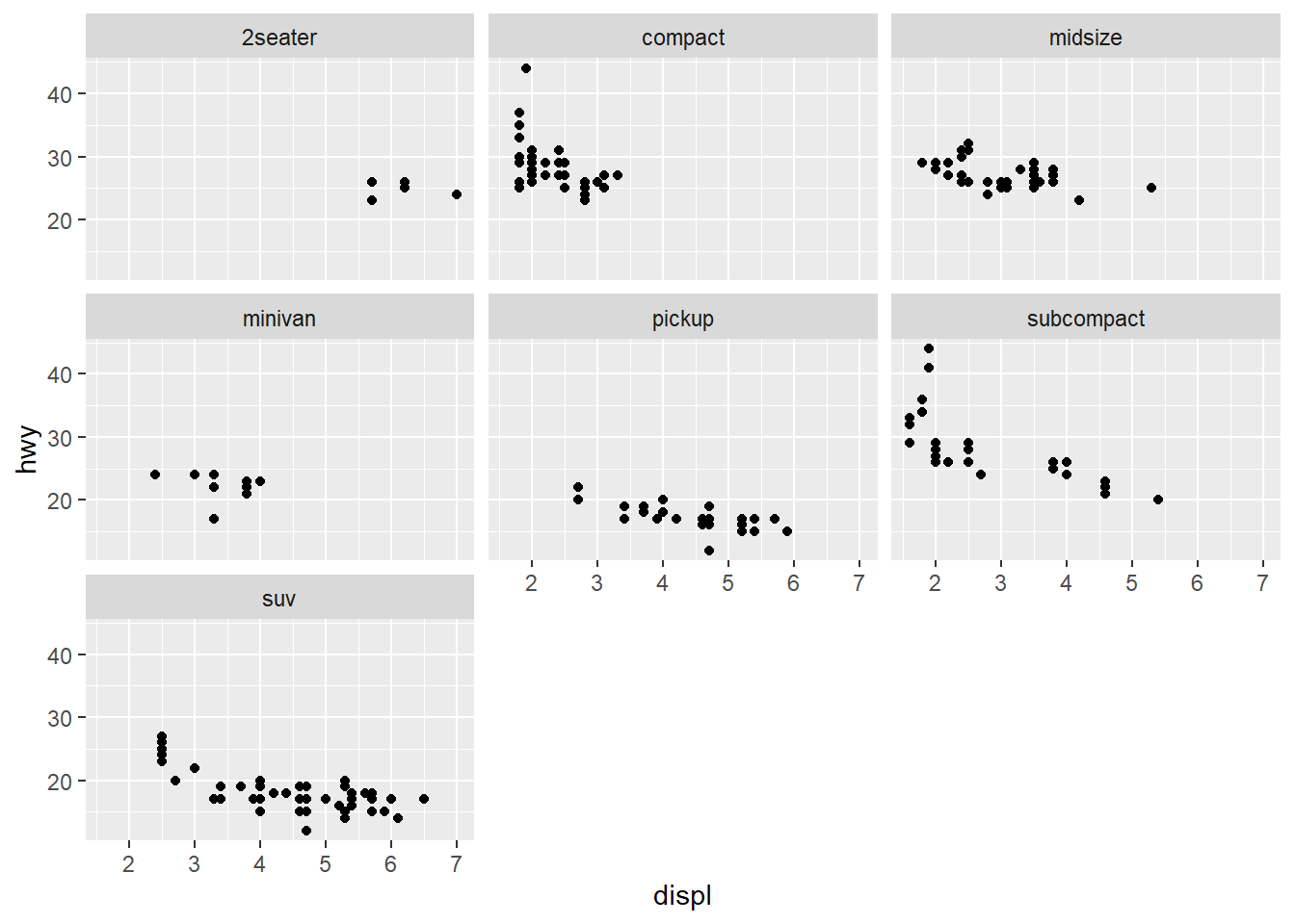
Faceting
ggplot (mpg, aes (displ, hwy)) + geom_point () + facet_wrap (~ class)
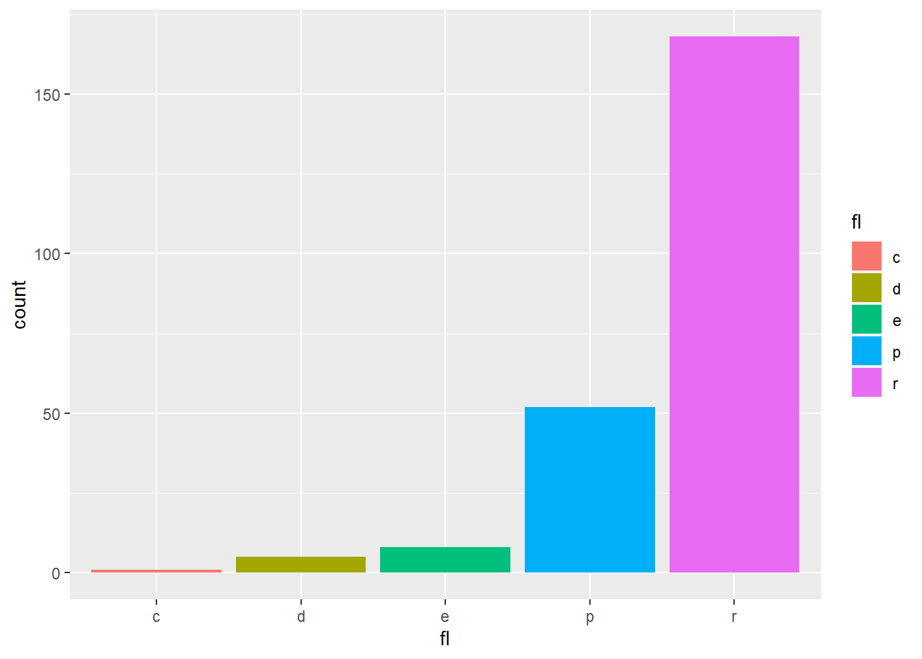
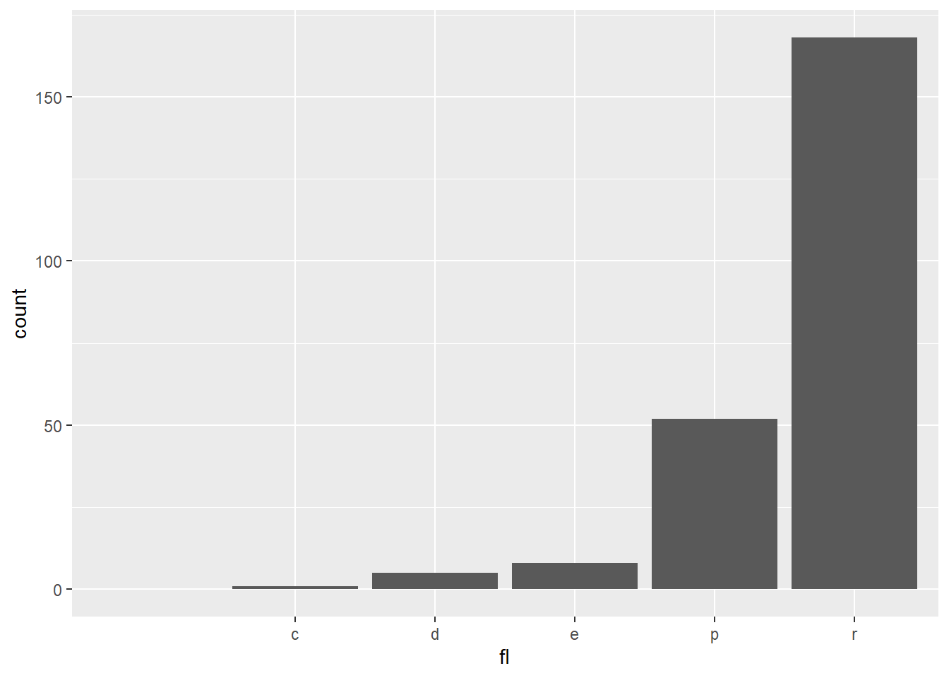
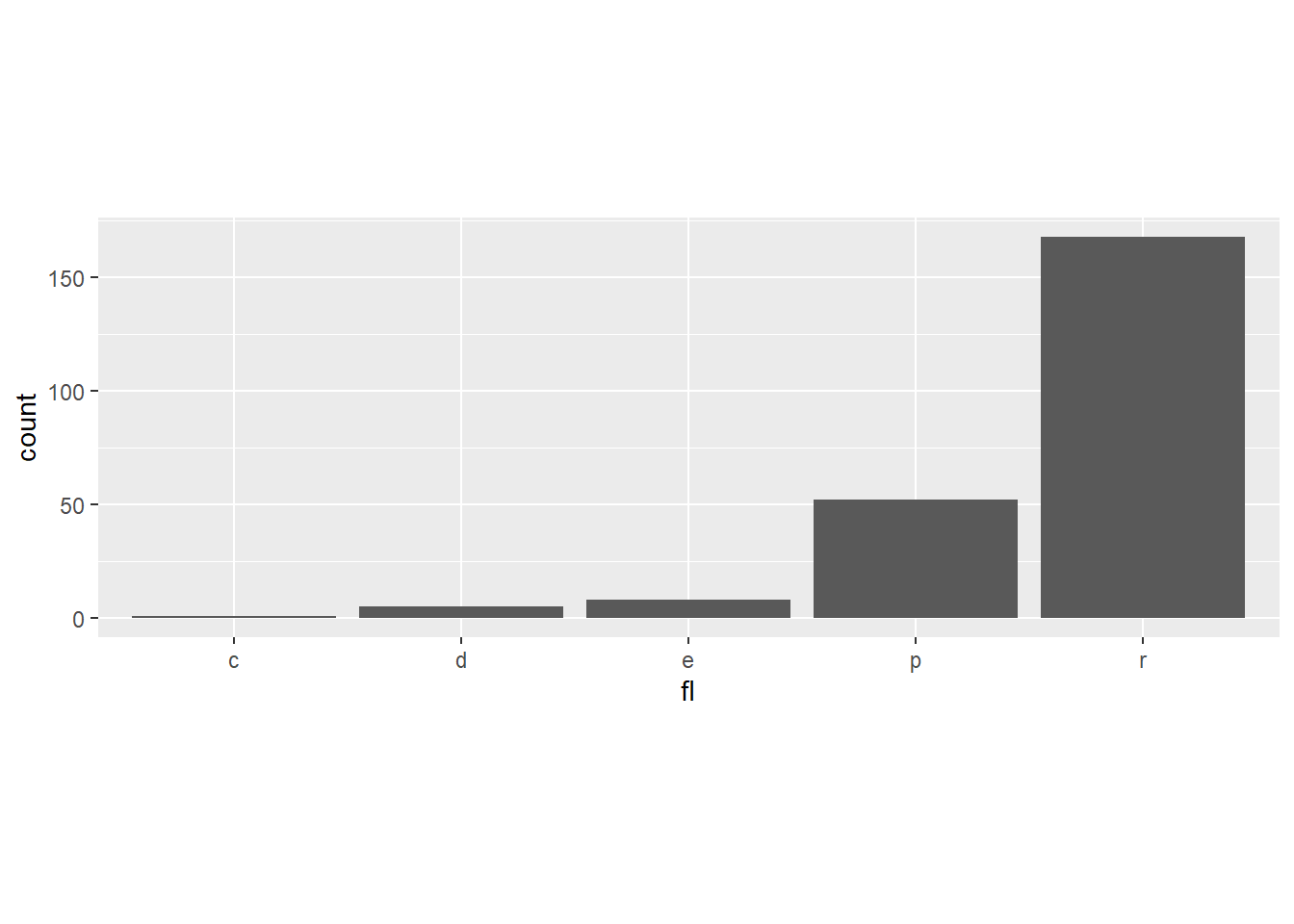
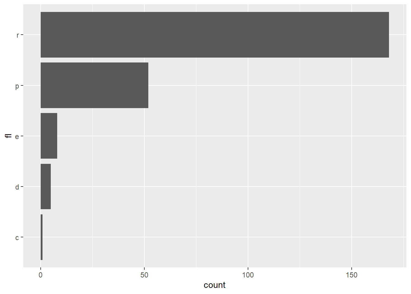
One variable (Discrete)
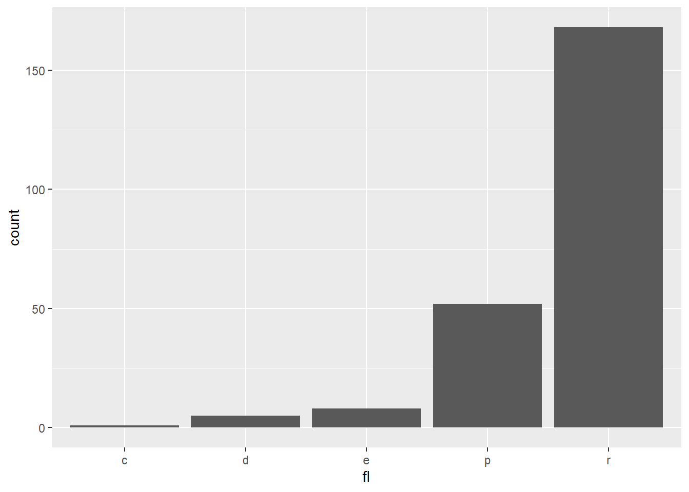
<- ggplot (mpg, aes (fl))+ geom_bar ()
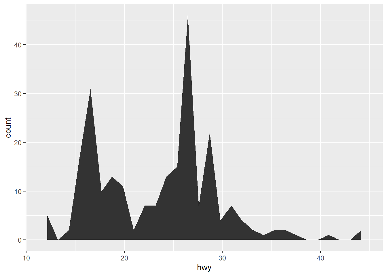
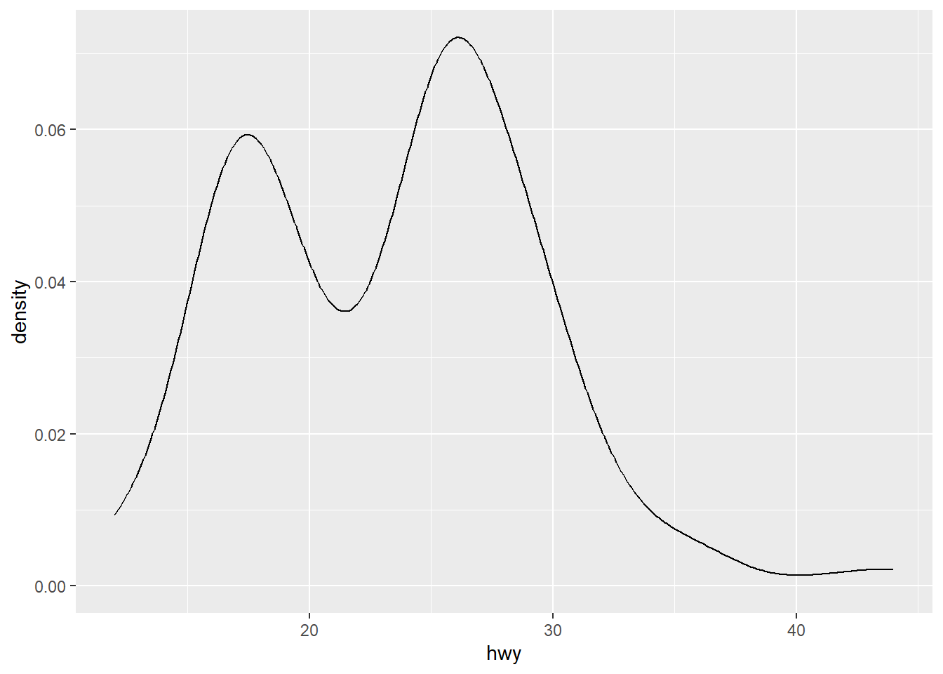
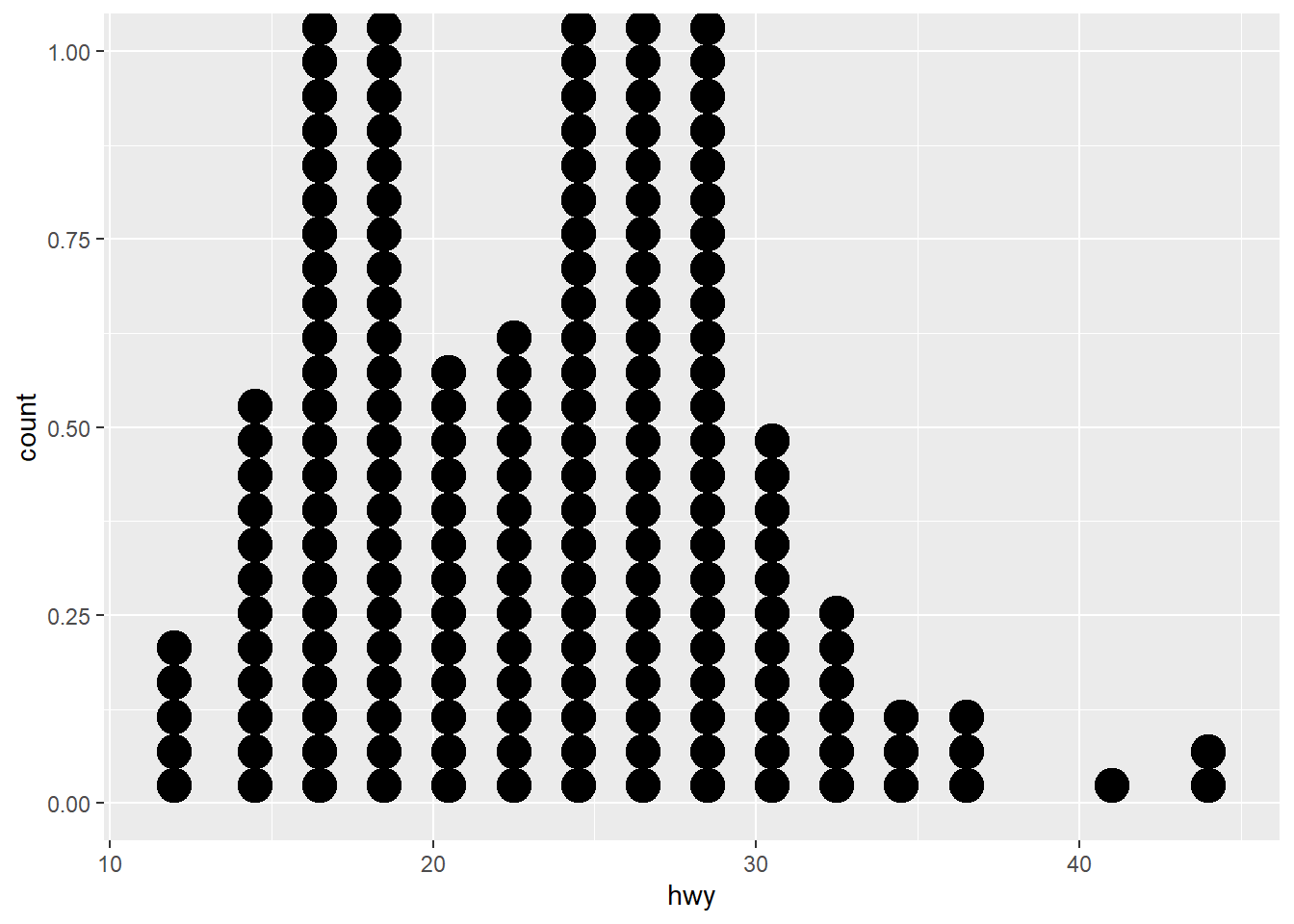
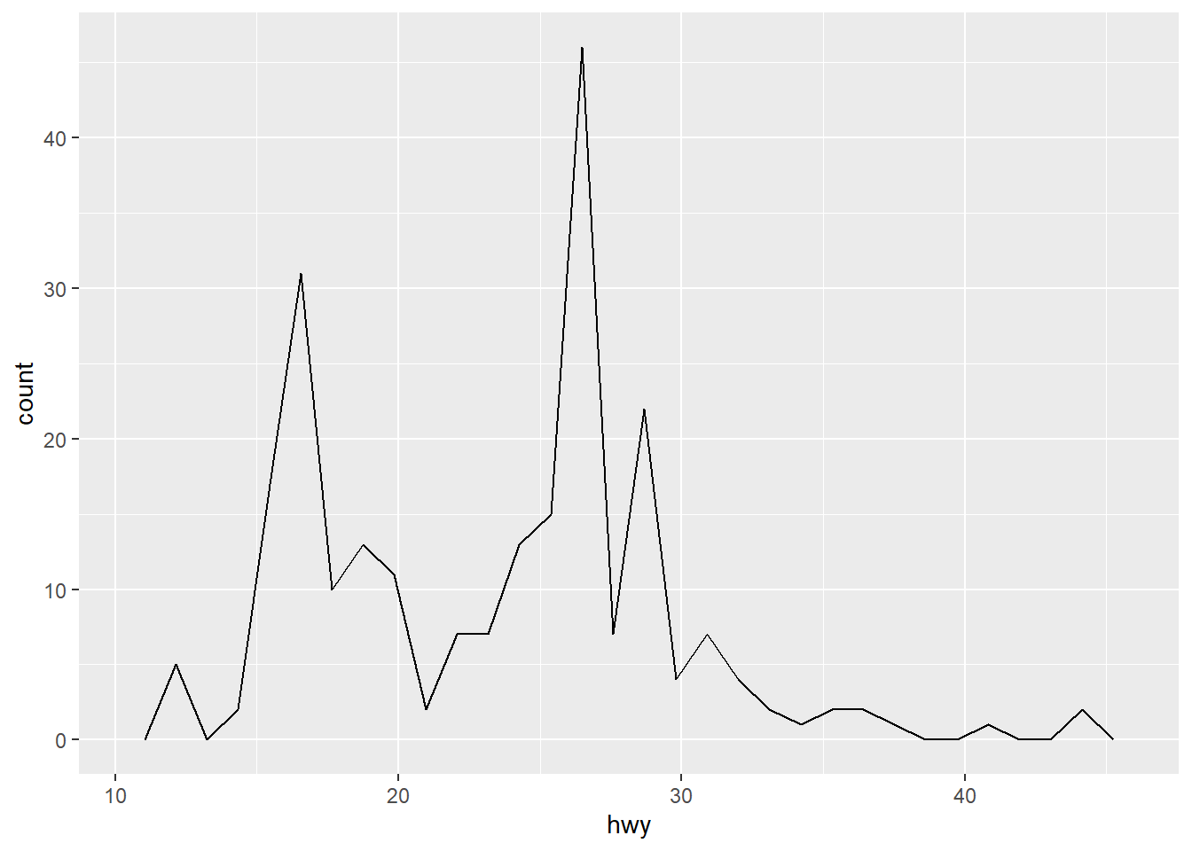
One variable (Cont.)
<- ggplot (mpg, aes (hwy))+ geom_area (stat = "bin" )
`stat_bin()` using `bins = 30`. Pick better value with `binwidth`.
+ geom_density (kernel = "gaussian" )
Bin width defaults to 1/30 of the range of the data. Pick better value with
`binwidth`.
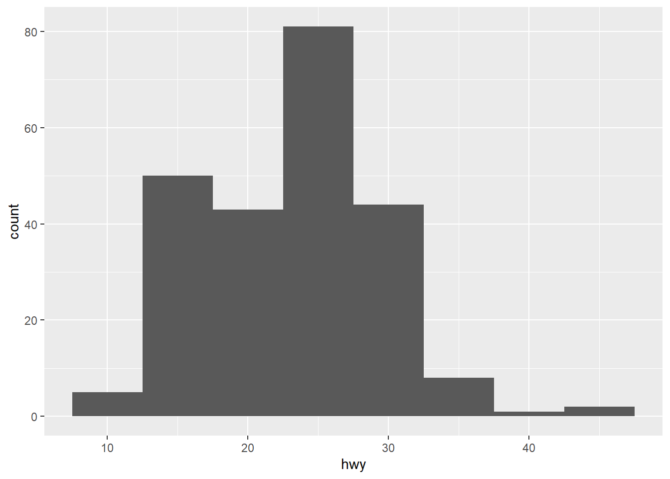
`stat_bin()` using `bins = 30`. Pick better value with `binwidth`.
+ geom_histogram (binwidth = 5 )
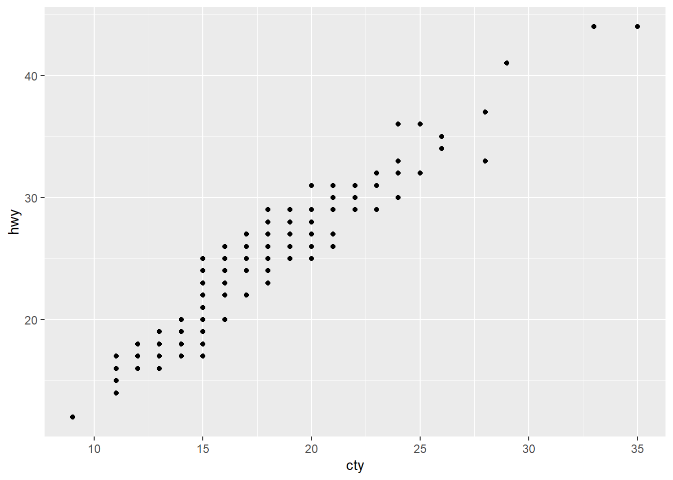
Two variables (Cont. & Cont.)
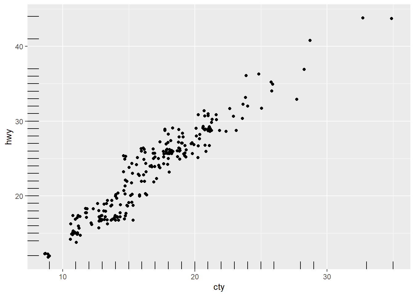
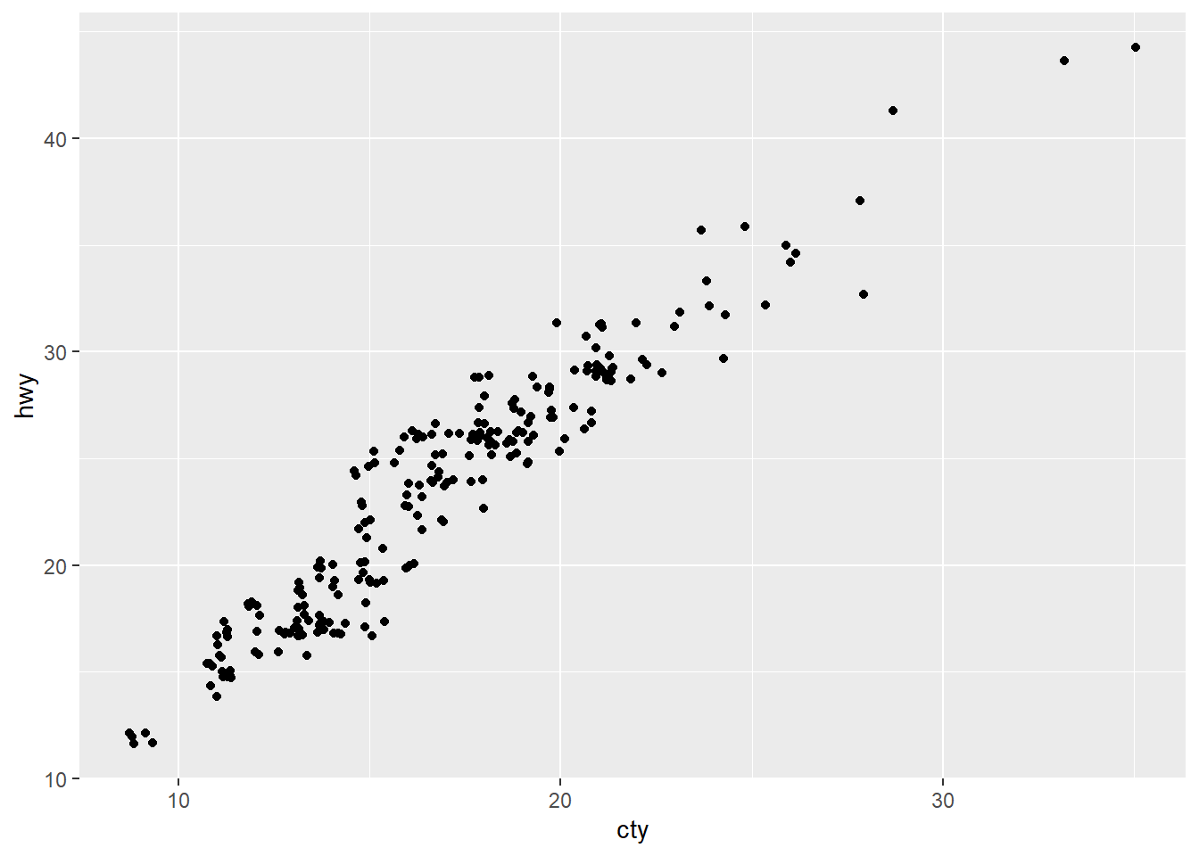
<- ggplot (mpg, aes (cty, hwy))+ geom_blank ()# install.packages("quantreg") library (quantreg)
Warning: package 'quantreg' was built under R version 4.4.2
Loading required package: SparseM
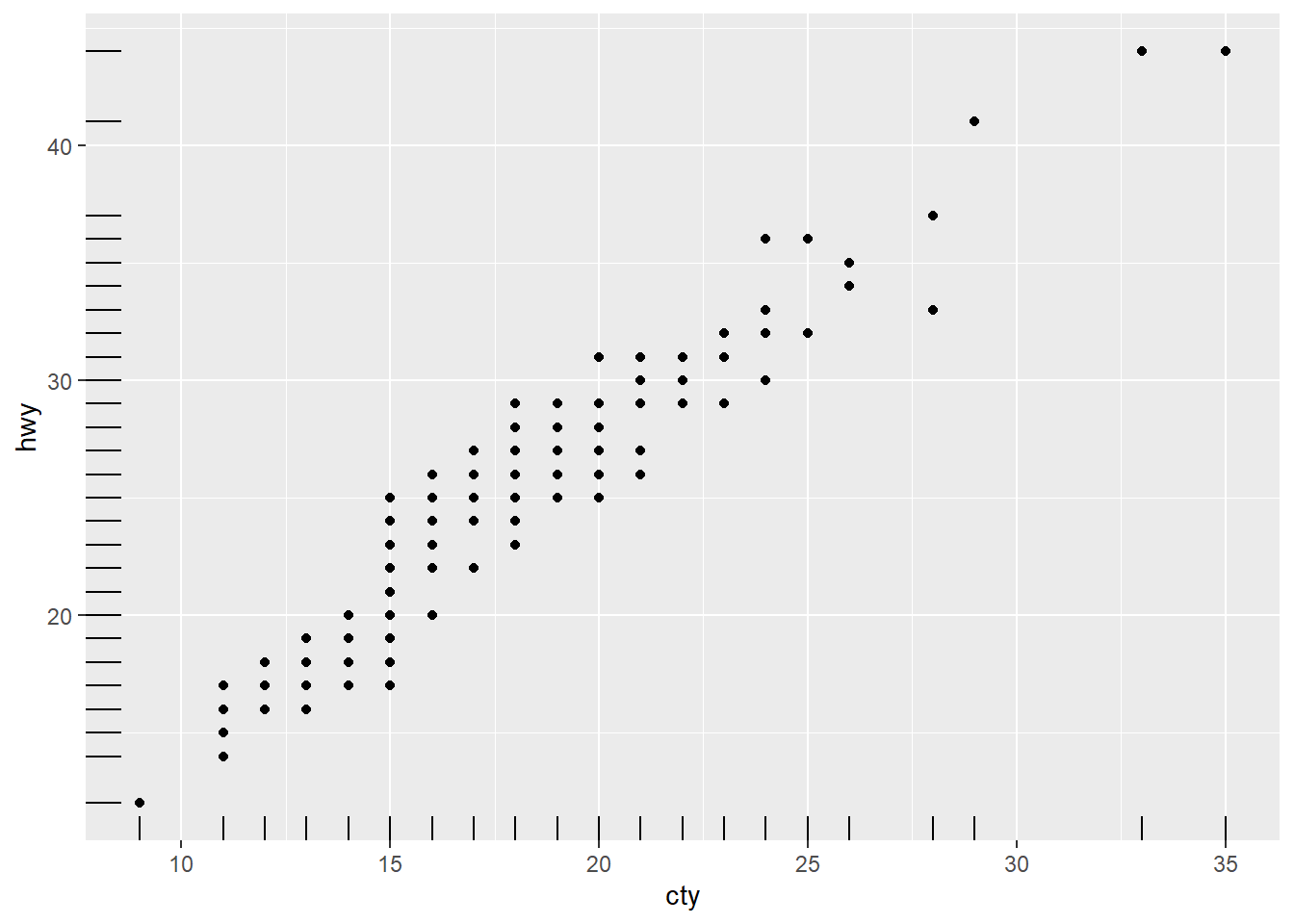
+ geom_quantile () + geom_jitter ()
Smoothing formula not specified. Using: y ~ x
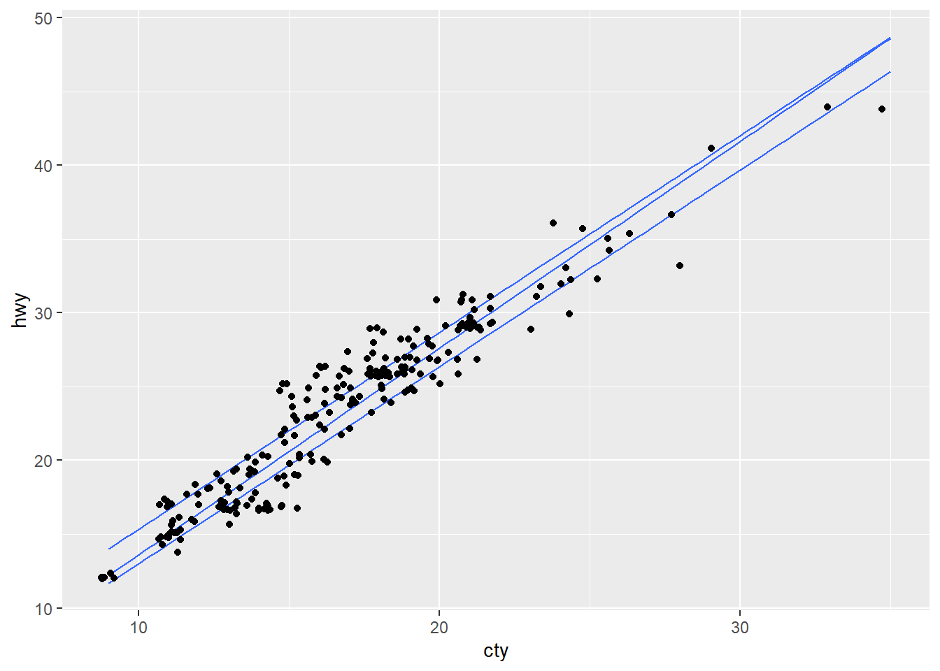
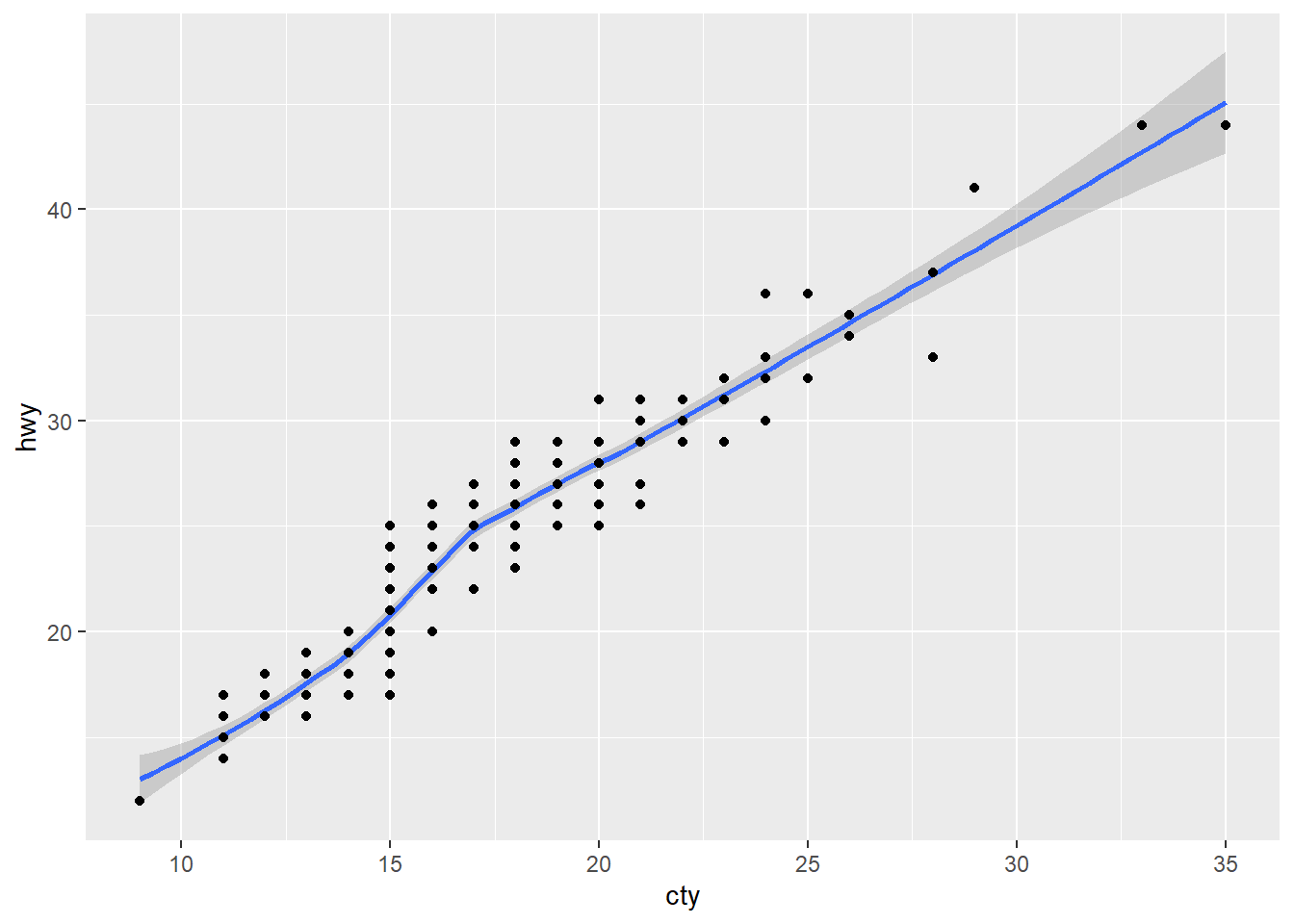
+ geom_rug (sides = "bl" ) + geom_jitter ()+ geom_rug (sides = "bl" ) + geom_point ()+ geom_smooth (model = lm) + geom_point ()
Warning in geom_smooth(model = lm): Ignoring unknown parameters: `model`
`geom_smooth()` using method = 'loess' and formula = 'y ~ x'
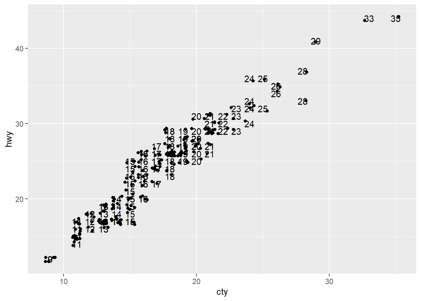
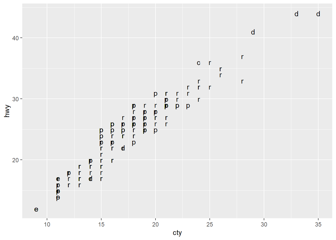
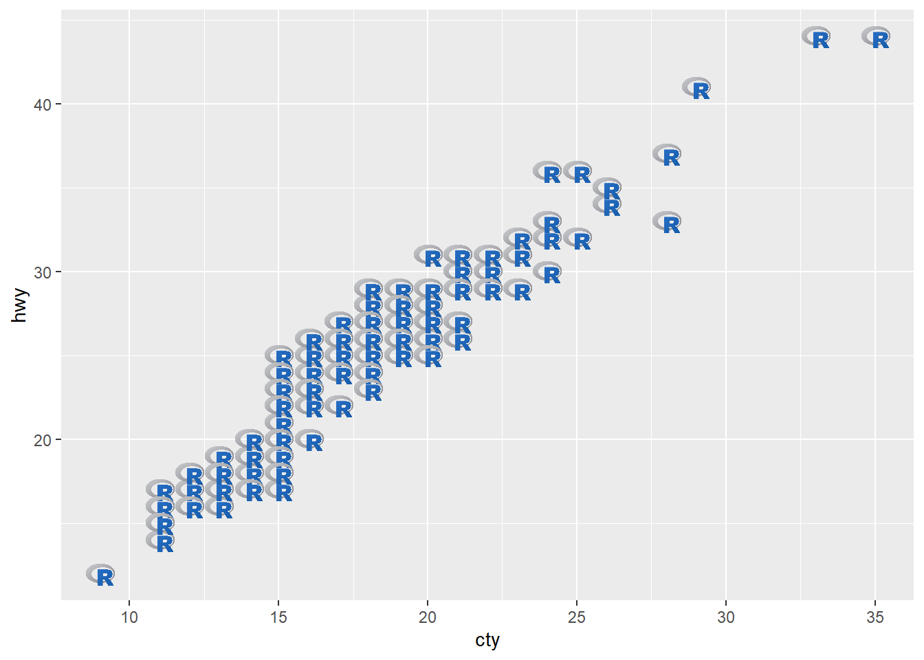
+ geom_text (aes (label = cty)) + geom_jitter ()+ geom_text (aes (label = fl))# install.packages("ggimage") library (ggimage)<- list.files (system.file ("extdata" , package= "ggimage" ),pattern= "png" , full.names= TRUE )+ geom_image (aes (image= img[2 ]))
Two variables (Discrete & Cont.)
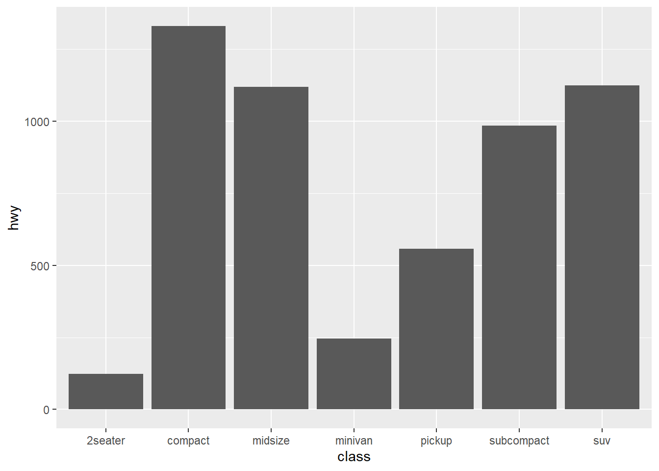
<- ggplot (mpg, aes (class, hwy))levels (as.factor (mpg$ class))
[1] "2seater"    "compact"    "midsize"    "minivan"    "pickup"
[6] "subcompact" "suv"
chr [1:234] "compact" "compact" "compact" "compact" "compact" "compact" ...
levels (as.factor (mpg$ class))
[1] "2seater"    "compact"    "midsize"    "minivan"    "pickup"
[6] "subcompact" "suv"
[1] "compact"    "midsize"    "suv"        "2seater"    "minivan"
[6] "pickup"     "subcompact"
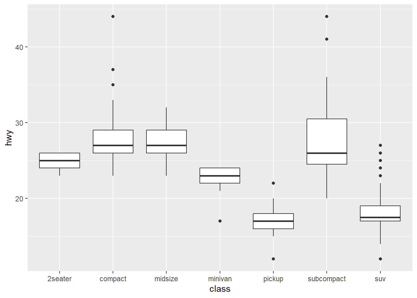
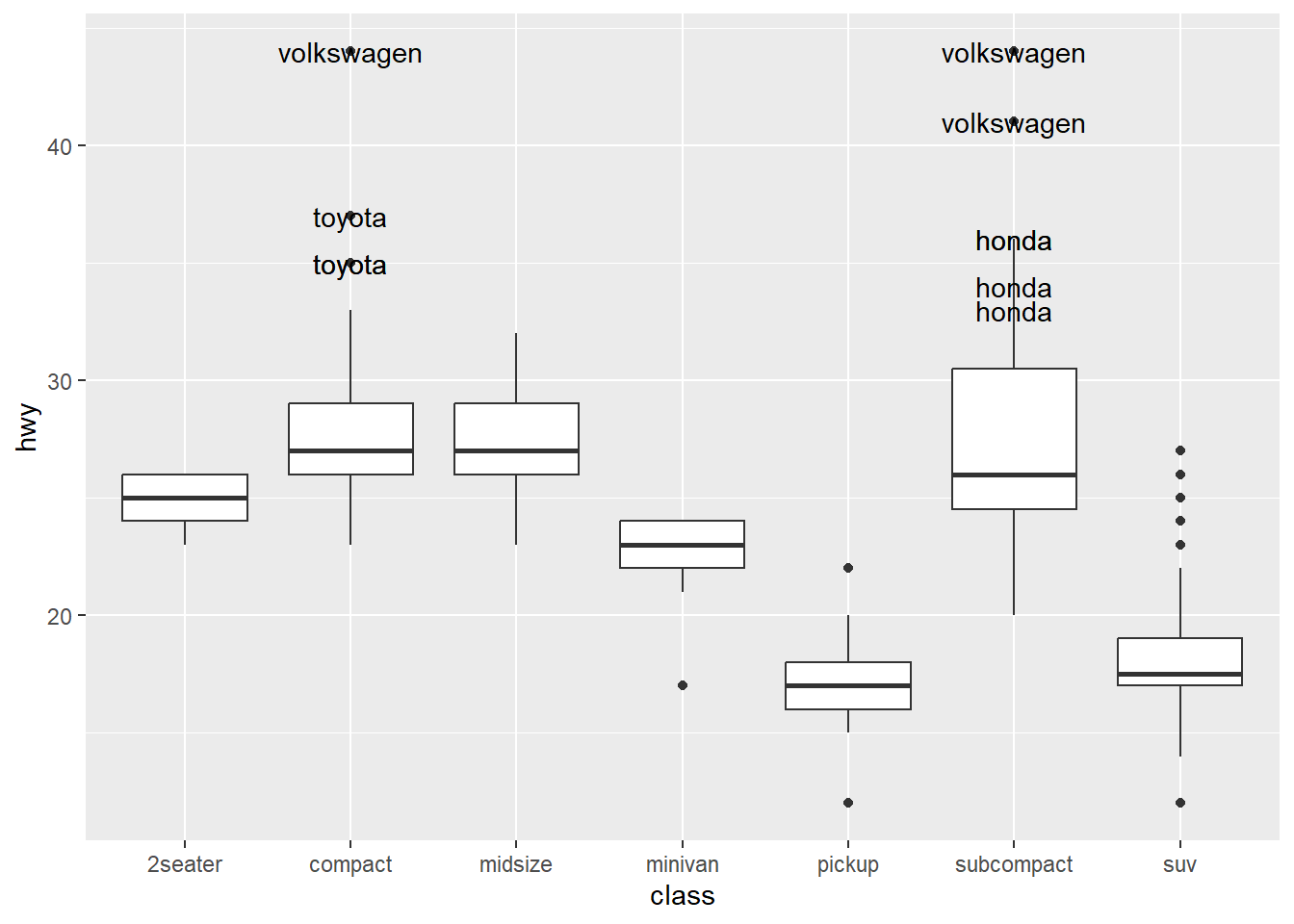
+ geom_bar (stat = "identity" )# Let's specify some cars %>% select (manufacturer, class, hwy) %>% group_by (class) %>% arrange (desc (hwy)) %>% head (10 ) -> text_in_graph
# A tibble: 10 × 3
# Groups:   class [2]
   manufacturer class        hwy
   <chr>        <chr>      <int>
 1 volkswagen   compact       44
 2 volkswagen   subcompact    44
 3 volkswagen   subcompact    41
 4 toyota       compact       37
 5 honda        subcompact    36
 6 honda        subcompact    36
 7 toyota       compact       35
 8 toyota       compact       35
 9 honda        subcompact    34
10 honda        subcompact    33
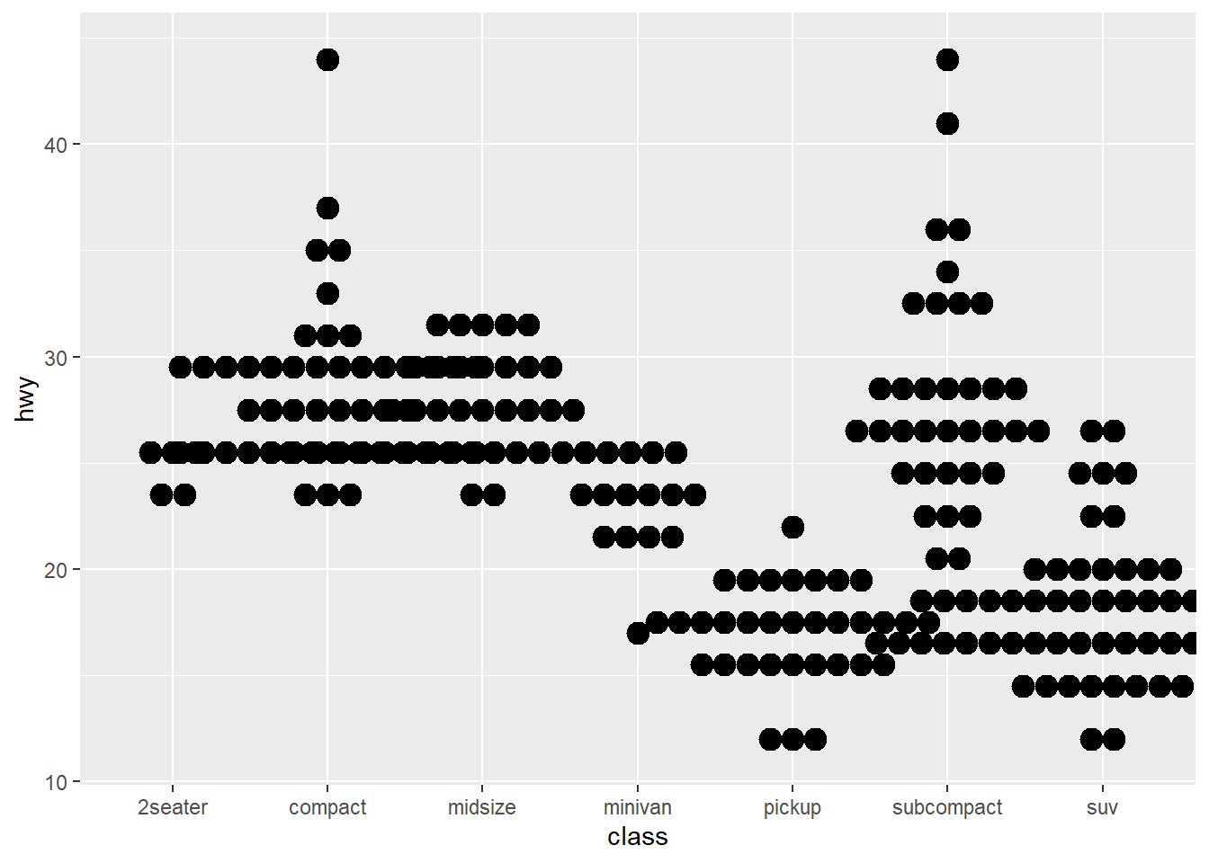
+ geom_boxplot () + geom_text (data= text_in_graph, aes (label = manufacturer))+ geom_dotplot (binaxis = "y" ,stackdir = "center" )
Bin width defaults to 1/30 of the range of the data. Pick better value with
`binwidth`.
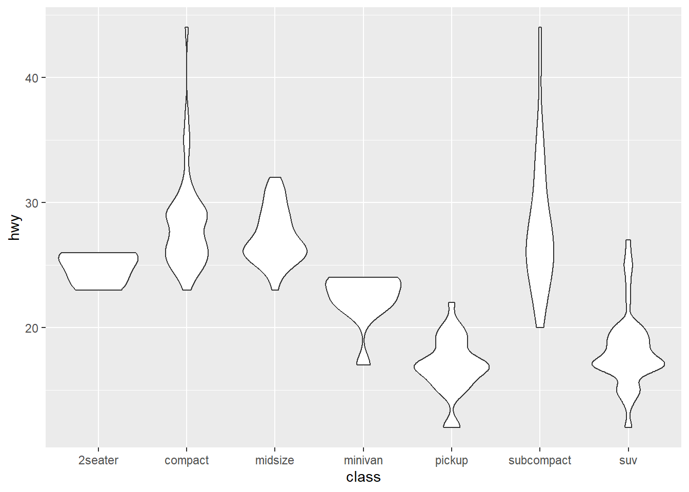
+ geom_violin (scale = "area" )
Two variables (Discrete & Discrete)
# A tibble: 6 × 10
  carat cut       color clarity depth table price     x     y     z
  <dbl> <ord>     <ord> <ord>   <dbl> <dbl> <int> <dbl> <dbl> <dbl>
1  0.23 Ideal     E     SI2      61.5    55   326  3.95  3.98  2.43
2  0.21 Premium   E     SI1      59.8    61   326  3.89  3.84  2.31
3  0.23 Good      E     VS1      56.9    65   327  4.05  4.07  2.31
4  0.29 Premium   I     VS2      62.4    58   334  4.2   4.23  2.63
5  0.31 Good      J     SI2      63.3    58   335  4.34  4.35  2.75
6  0.24 Very Good J     VVS2     62.8    57   336  3.94  3.96  2.48
<- ggplot (diamonds, aes (cut, color))+ geom_jitter ()
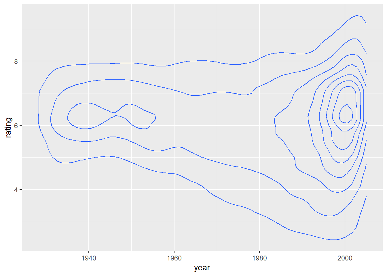
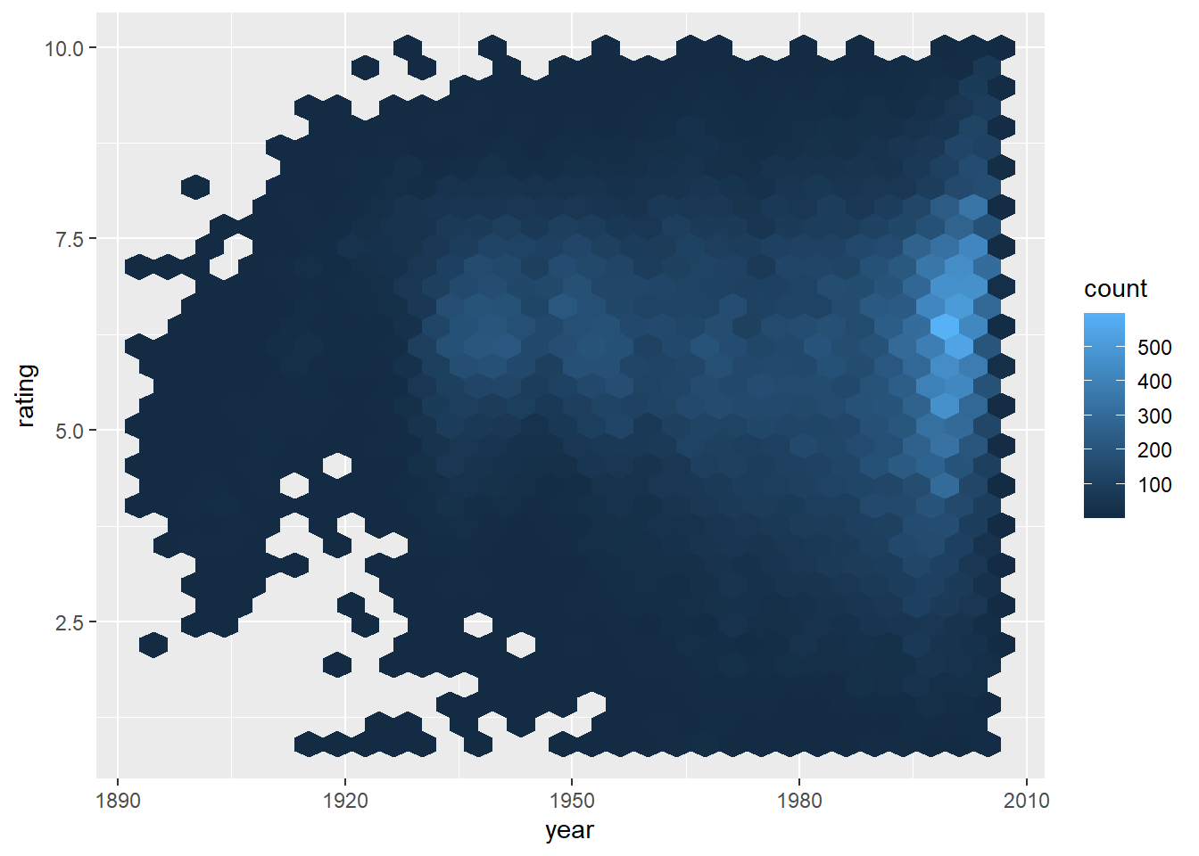
Continuous Bivariate Distribution
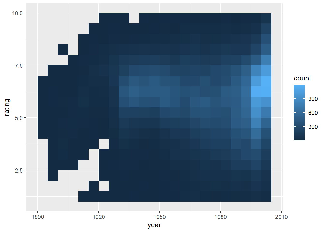
# install.packages("ggplot2movies") library (ggplot2movies)<- ggplot (movies, aes (year, rating))+ geom_bin2d (binwidth = c (5 , 0.5 ))# install.packages("hexbin") library (hexbin)+ geom_hex ()
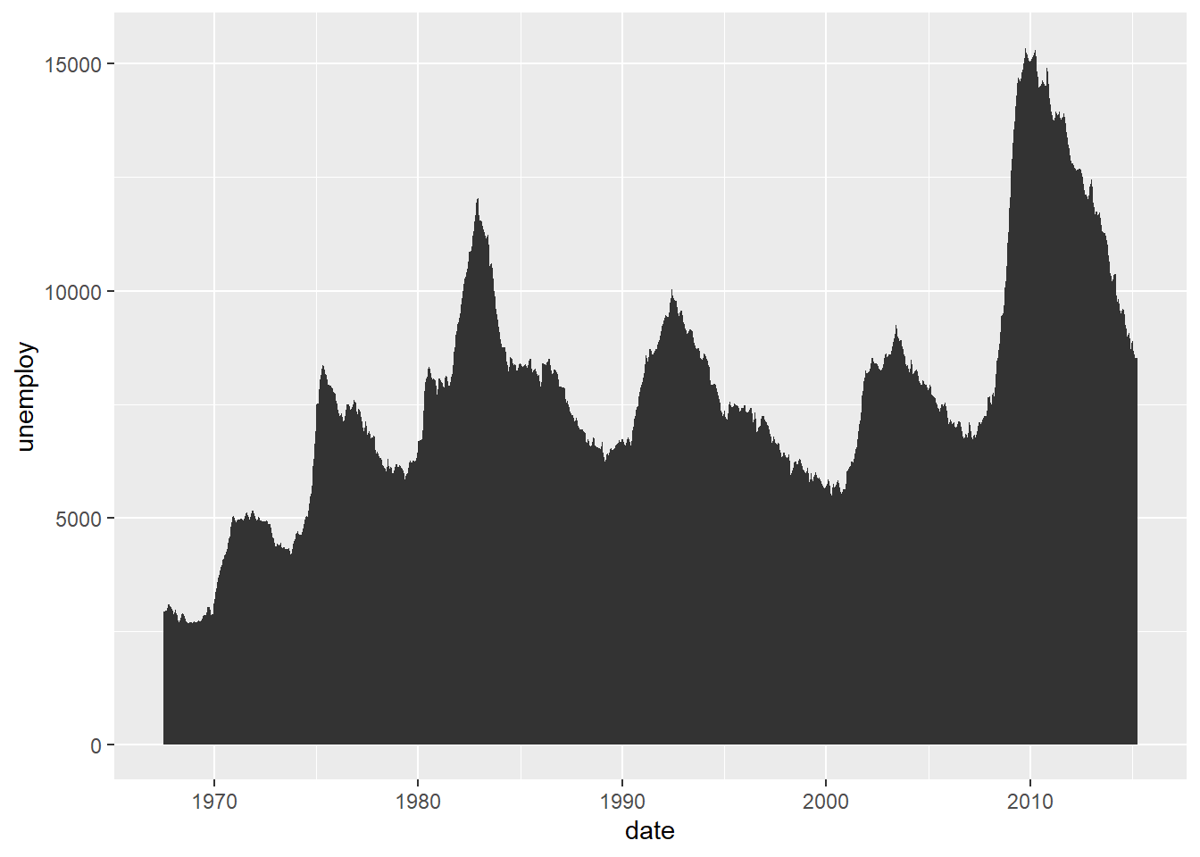
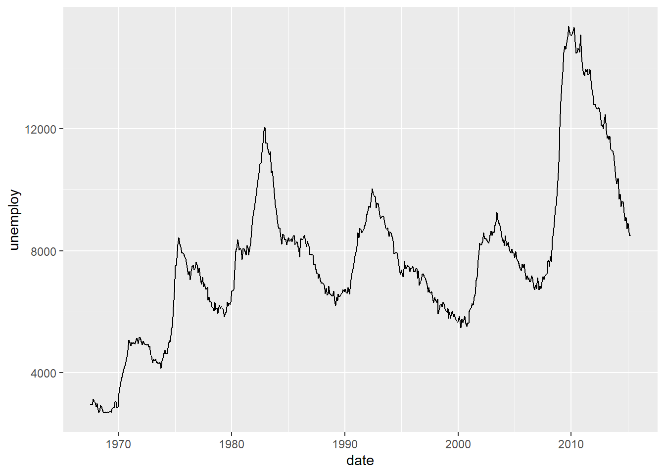
Continuous functions (time-series)
<- ggplot (economics, aes (date, unemploy))+ geom_area ()+ geom_step (direction = "hv" )
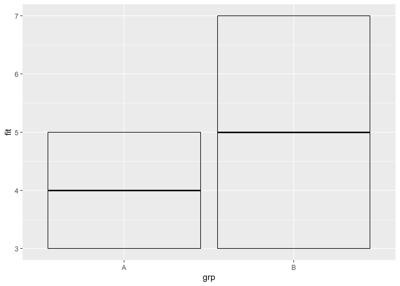
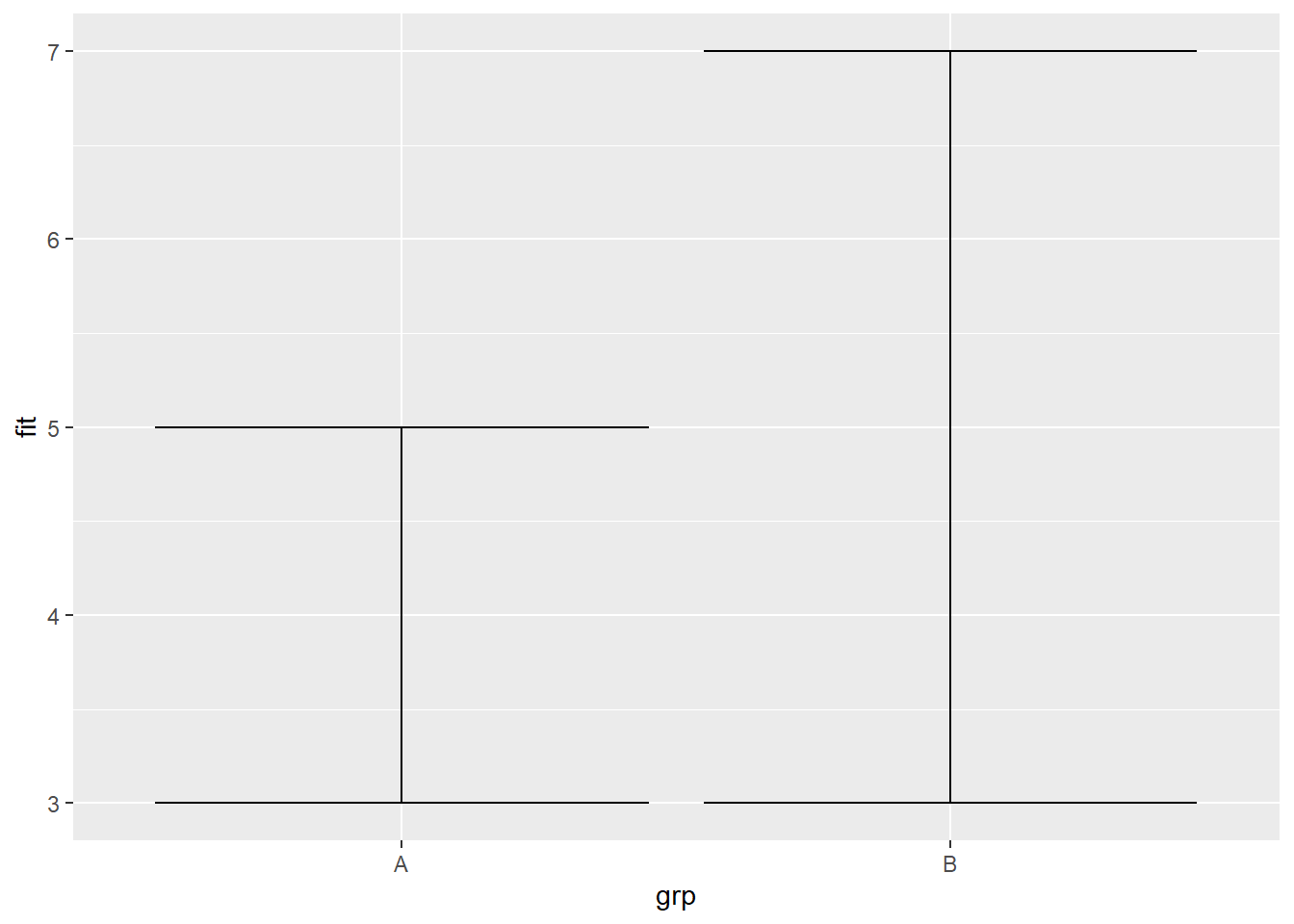
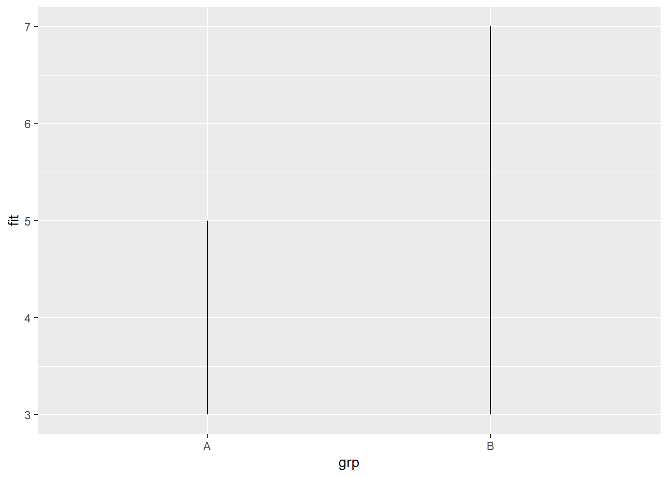
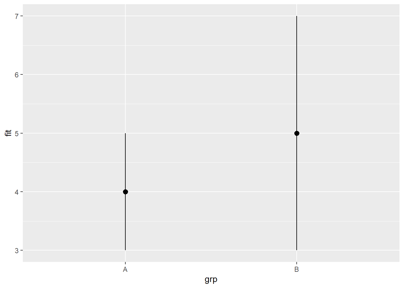
Visualizing bars with errors
# Visualizing error <- data.frame (grp = c ("A" , "B" ), fit = 4 : 5 , se = 1 : 2 )<- ggplot (df, aes (grp, fit, ymin = fit- se, ymax = fit+ se))+ geom_crossbar (fatten = 2 )
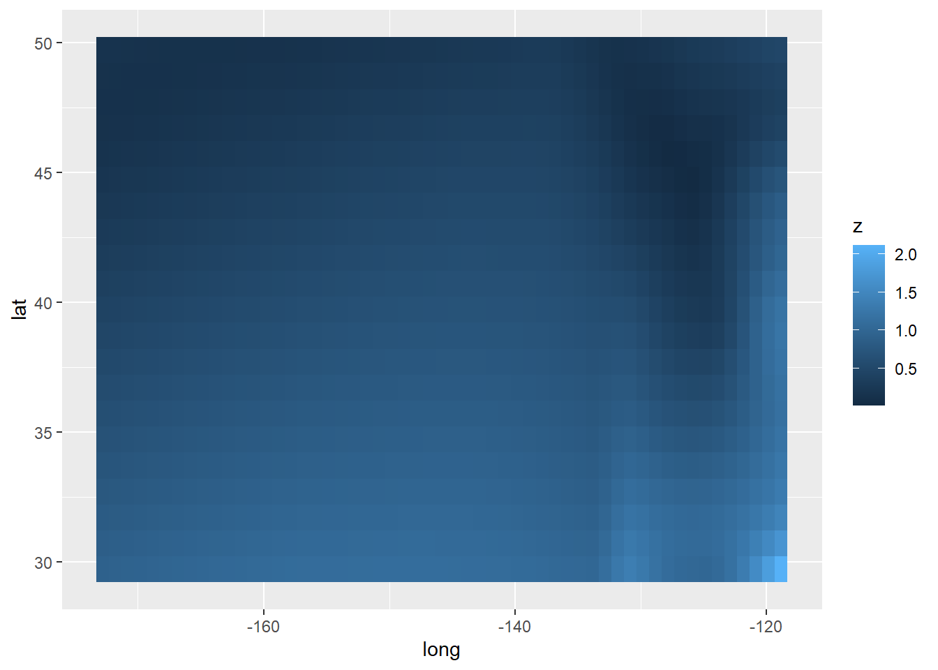
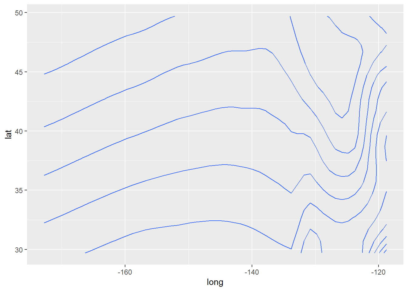
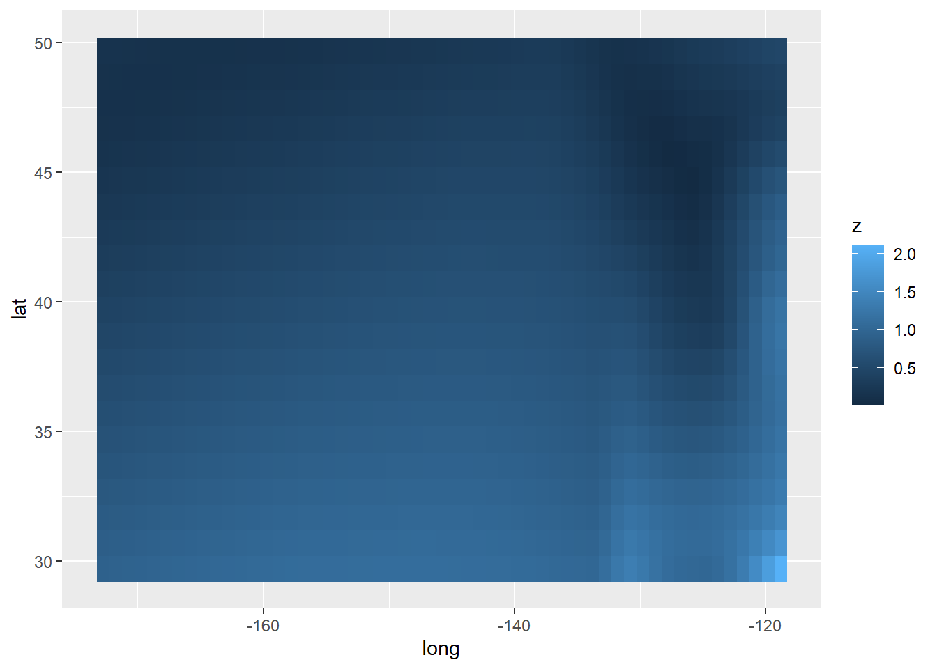
Three variables
$ z <- with (seals, sqrt (delta_long^ 2 + delta_lat^ 2 ))<- ggplot (seals, aes (long, lat))+ geom_tile (aes (fill = z))+ geom_contour (aes (z = z))+ geom_raster (aes (fill = z), hjust= 0.5 ,vjust= 0.5 , interpolate= FALSE )
Scales
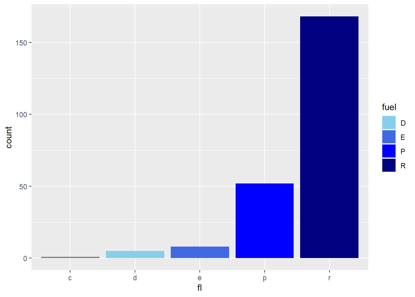
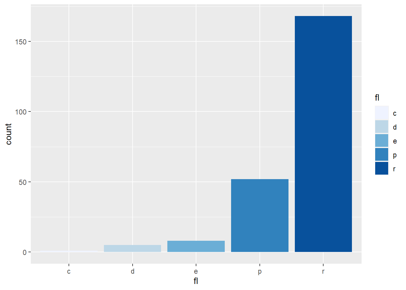
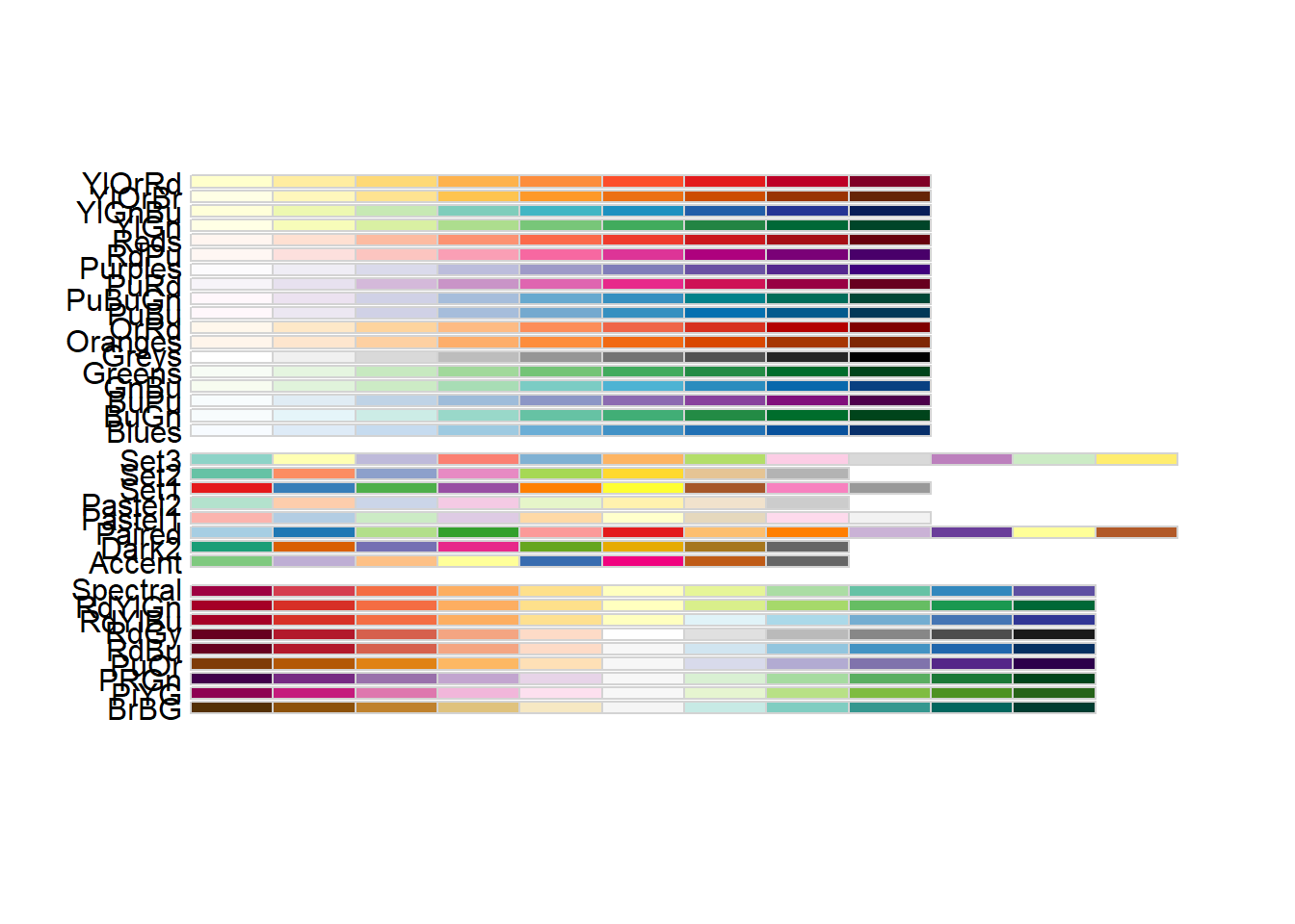
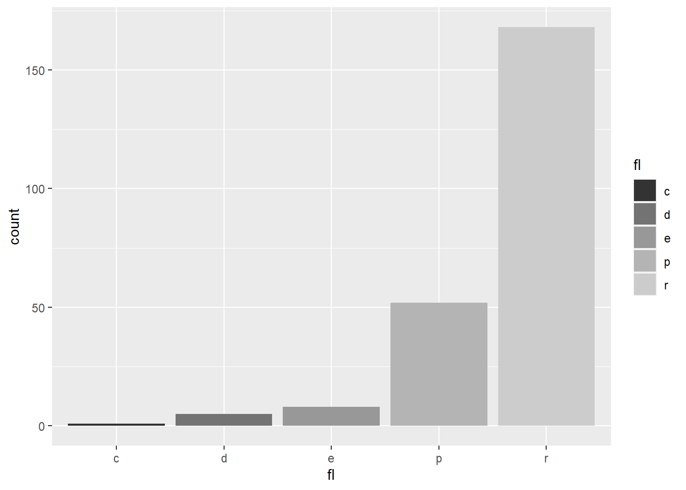
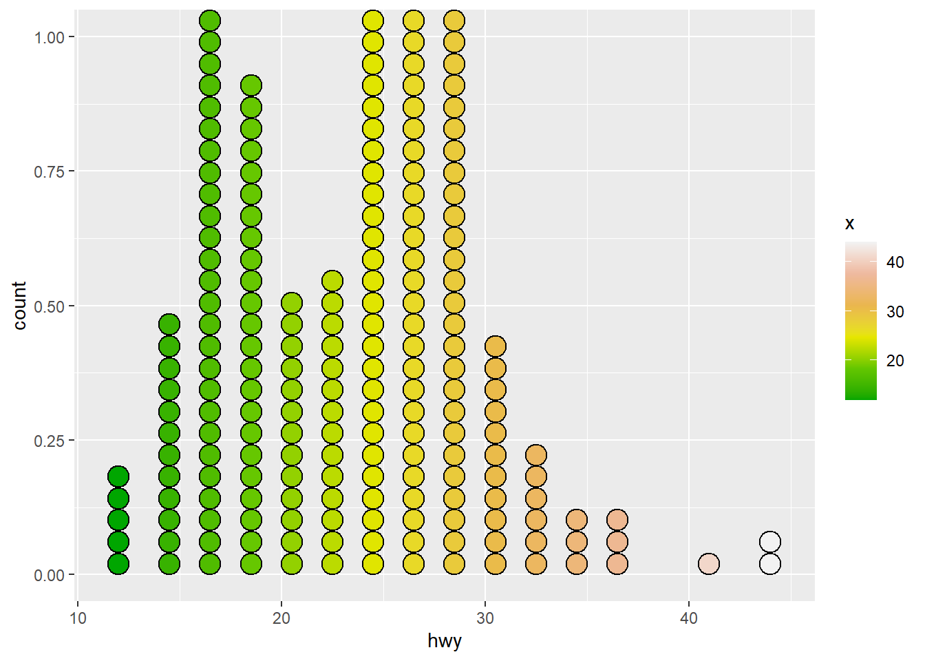
<- b + geom_bar (aes (fill = fl))+ scale_fill_manual (values = c ("skyblue" , "royalblue" , "blue" , "navy" ),limits = c ("d" , "e" , "p" , "r" ), breaks = c ("d" , "e" , "p" , "r" ),name = "fuel" , labels = c ("D" , "E" , "P" , "R" ))# Color and fill scales <- b + geom_bar (aes (fill = fl))<- a + geom_dotplot (aes (fill = ..x..))# install.packages("RColorBrewer") library (RColorBrewer)+ scale_fill_brewer (palette = "Blues" )+ scale_fill_grey (start = 0.2 , end = 0.8 ,na.value = "red" )+ scale_fill_gradient (low = "red" ,high = "yellow" )
Warning: The dot-dot notation (`..x..`) was deprecated in ggplot2 3.4.0.
ℹ Please use `after_stat(x)` instead.
Bin width defaults to 1/30 of the range of the data. Pick better value with
`binwidth`.
+ scale_fill_gradientn (colours = terrain.colors (6 ))
Bin width defaults to 1/30 of the range of the data. Pick better value with
`binwidth`.
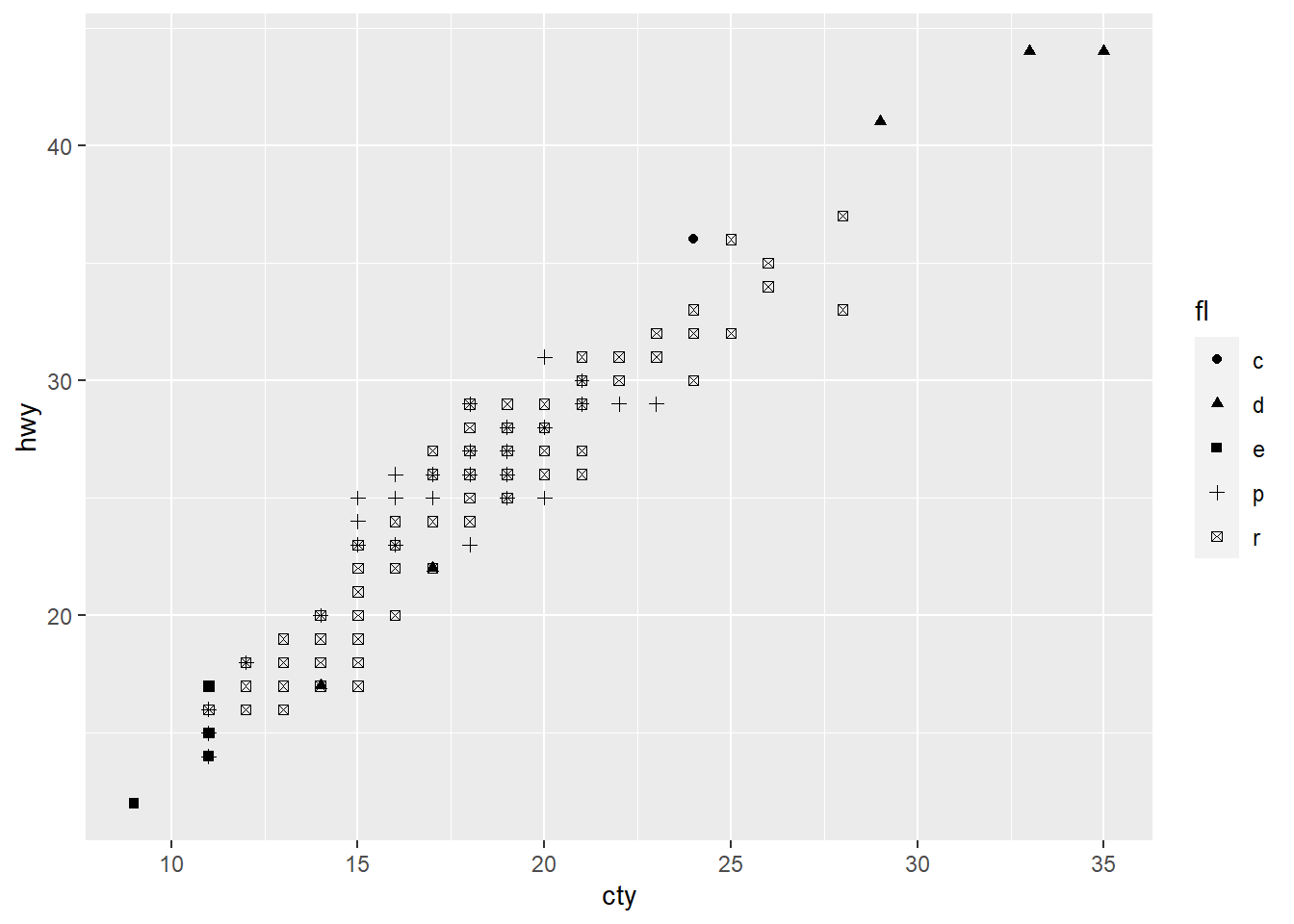
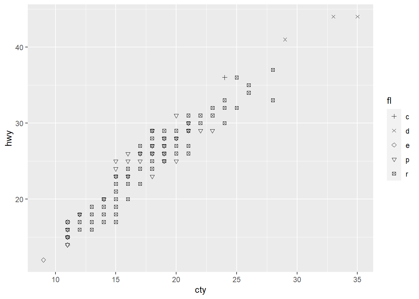
# Also: rainbow(), heat.colors(), # topo.colors(), cm.colors(), # RColorBrewer::brewer.pal() # Shape scales <- f + geom_point (aes (shape = fl))+ scale_shape (solid = FALSE )+ scale_shape_manual (values = c (3 : 7 ))# Size scales <- f + geom_point (aes (size = cyl))
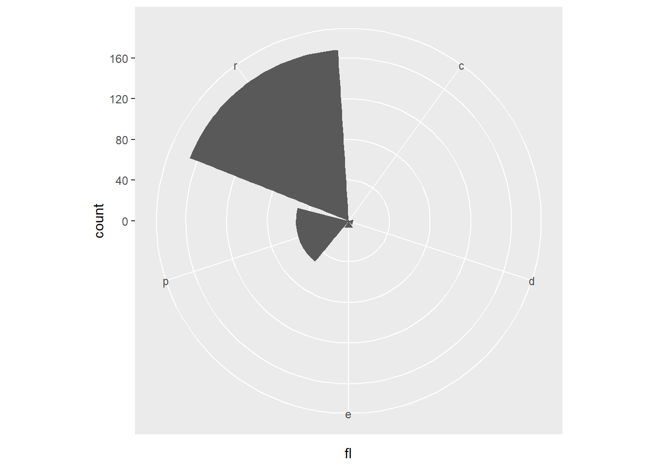
Coordinate systems
<- b+ geom_bar ()+ coord_cartesian (xlim = c (0 , 5 ))+ coord_fixed (ratio = 1 / 2 )+ coord_fixed (ratio = 1 / 10 )+ coord_fixed (ratio = 1 / 100 )+ coord_polar (theta = "x" , direction= 1 )
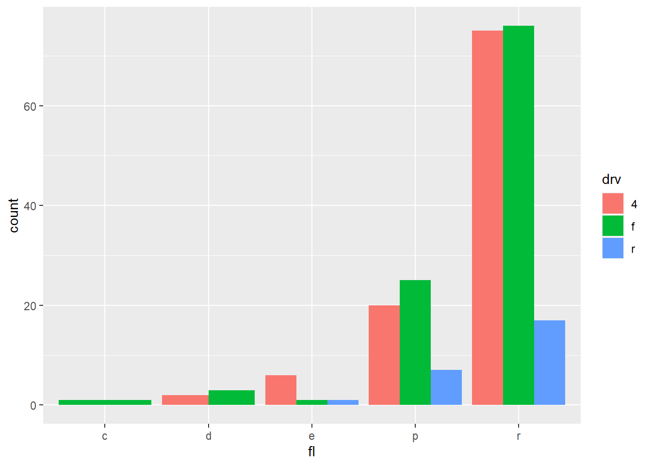
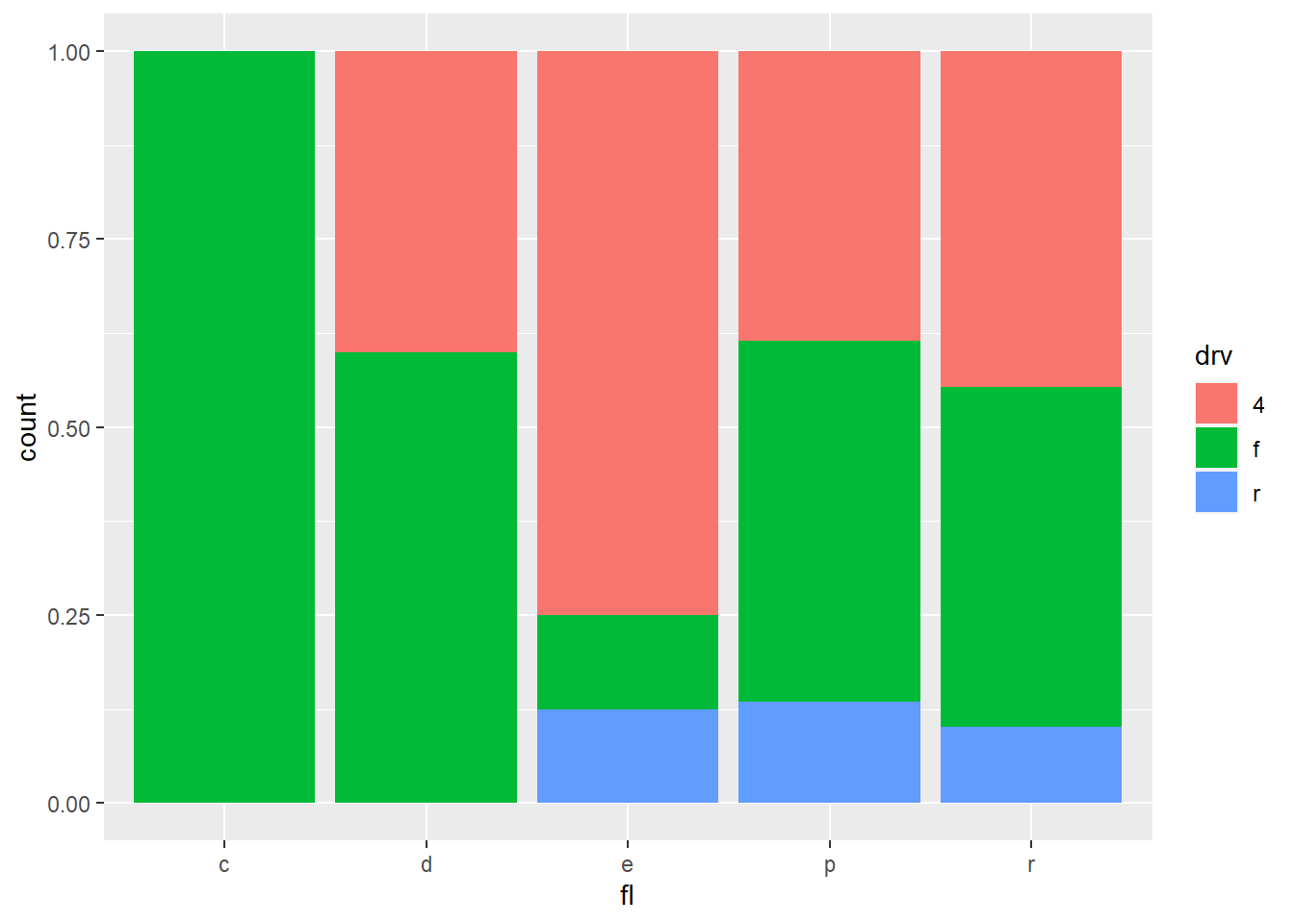
Position adjustments
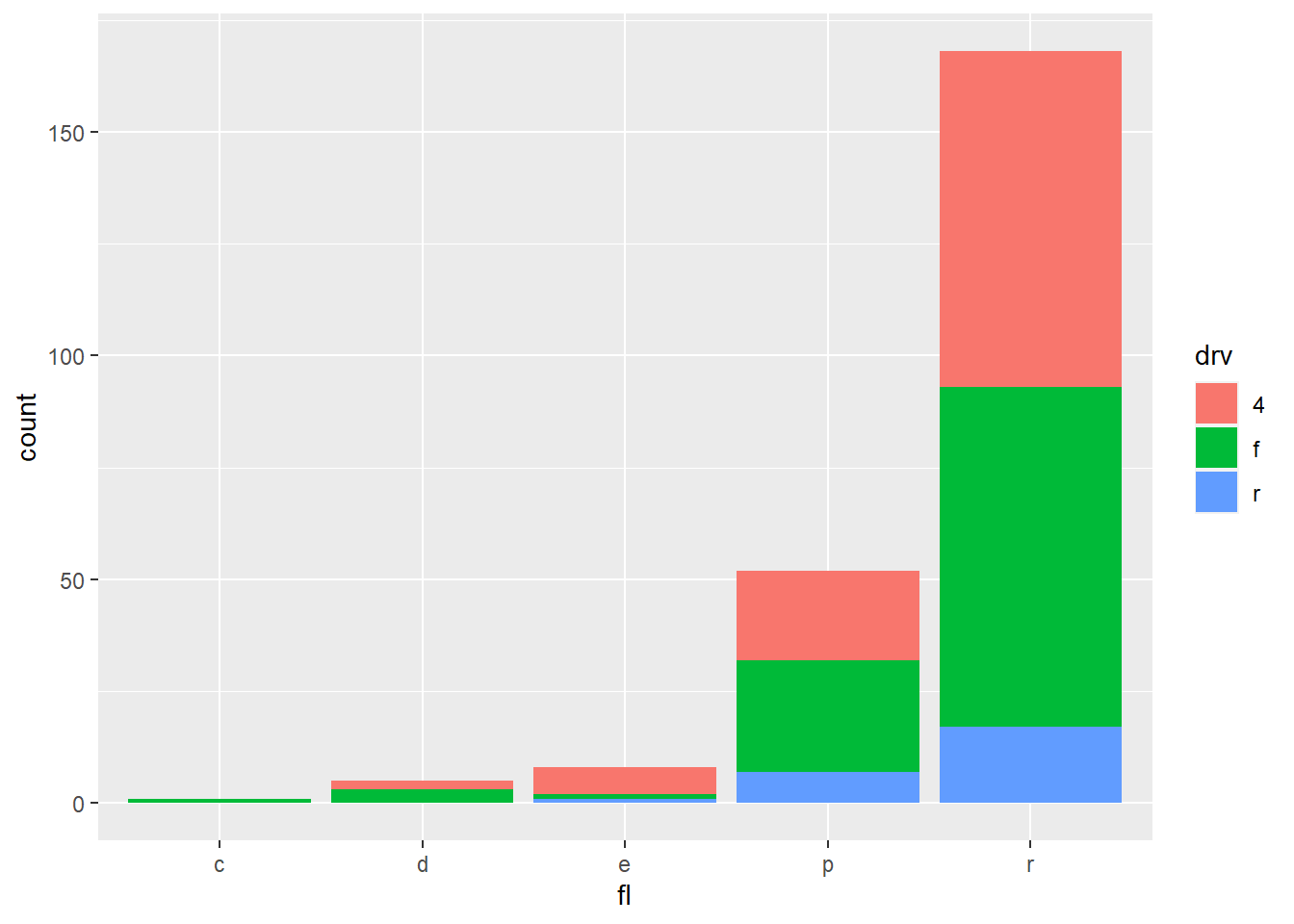
<- ggplot (mpg, aes (fl, fill = drv))+ geom_bar (position = "dodge" )# Arrange elements side by side + geom_bar (position = "fill" )# Stack elements on top of one another, normalize height + geom_bar (position = "stack" )# Stack elements on top of one another + geom_point (position = "jitter" )# Add random noise to X and Y position of each element to avoid overplotting
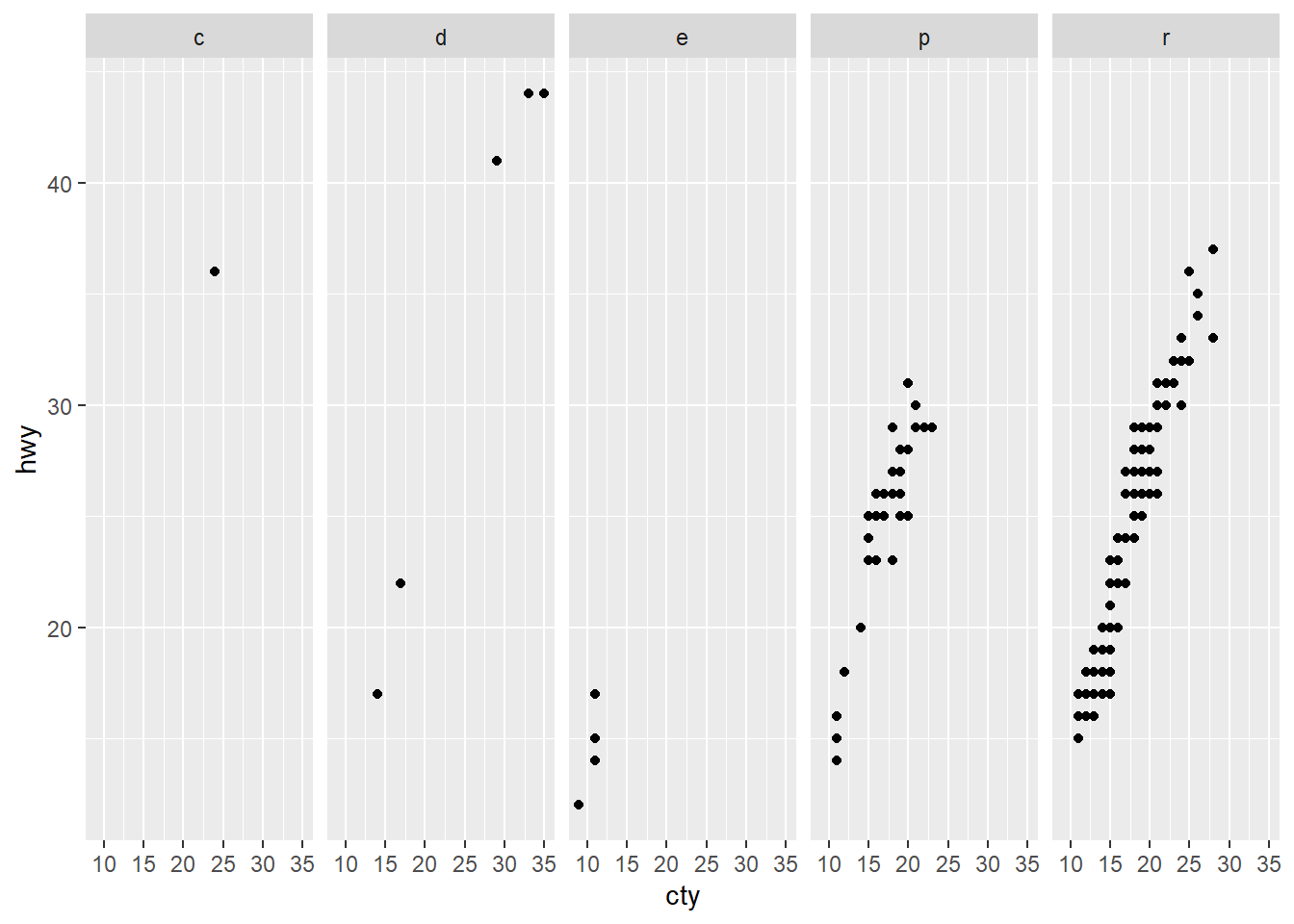
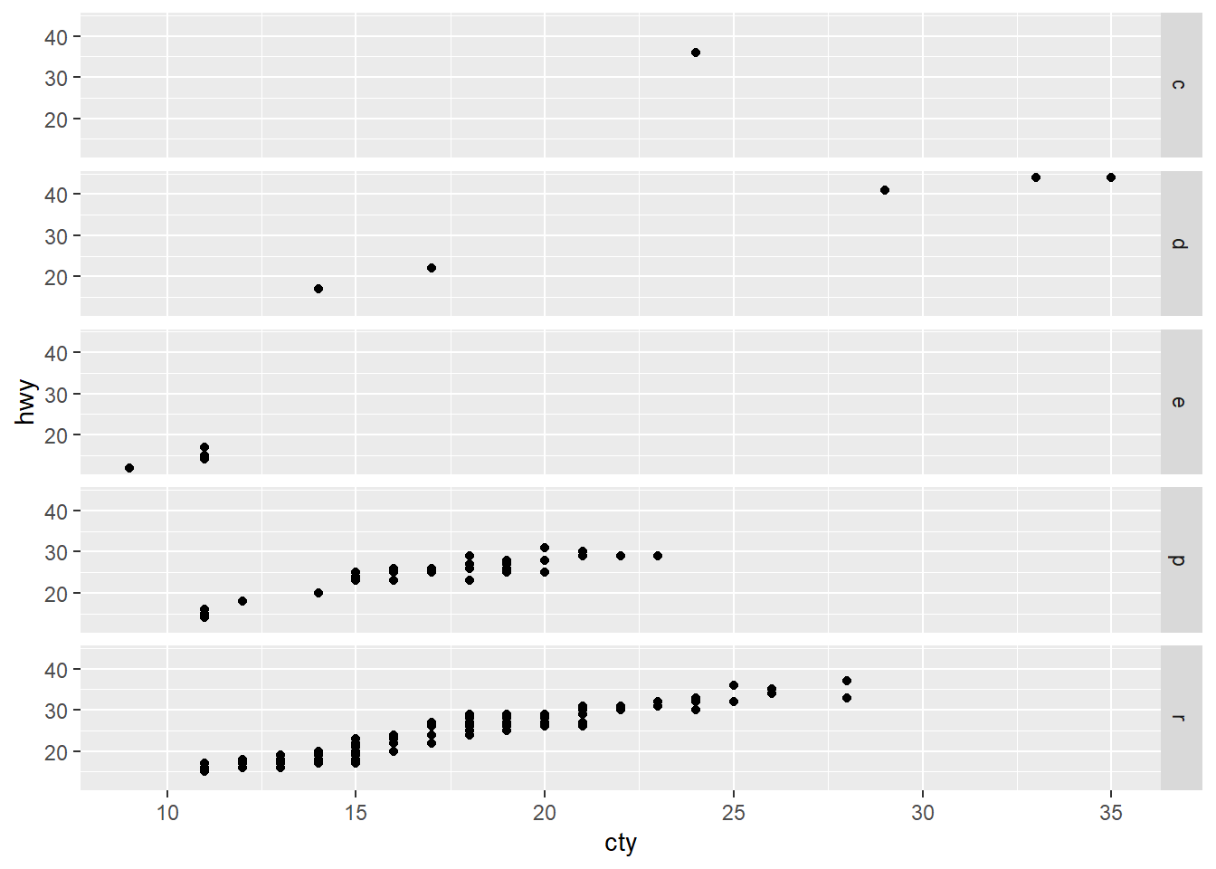
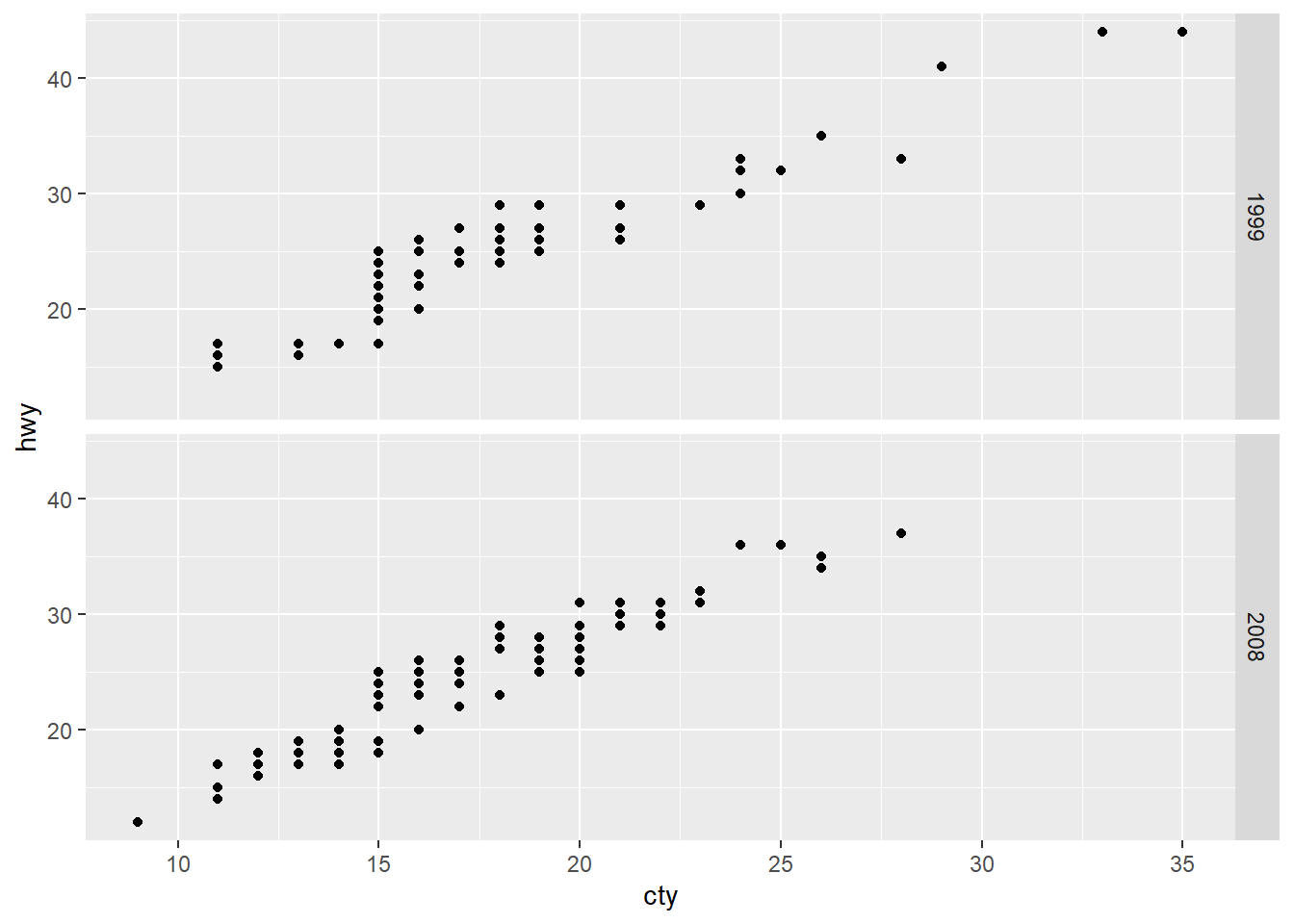
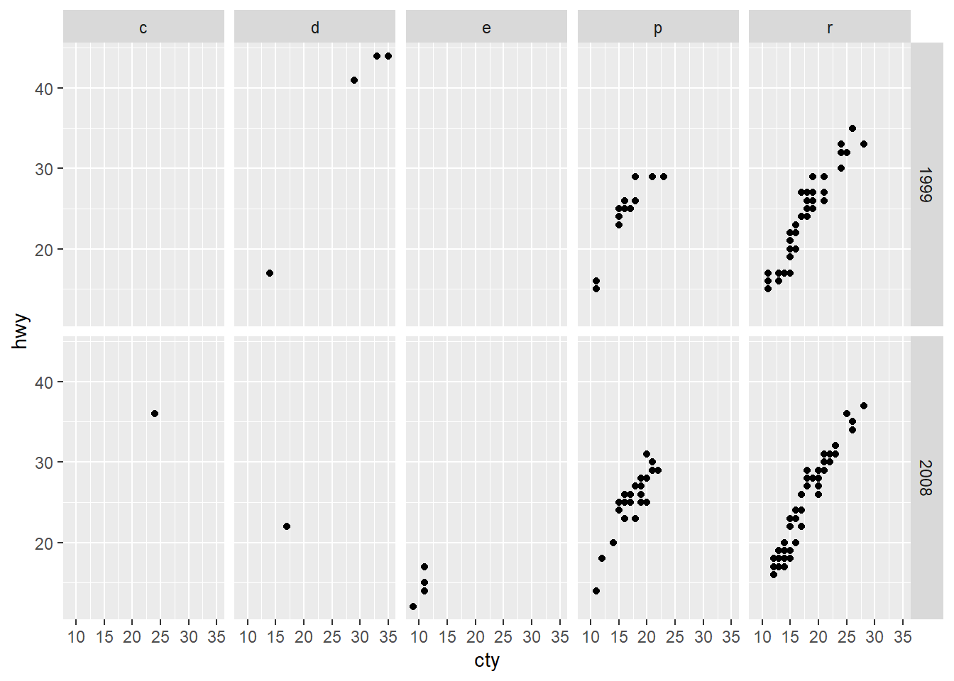
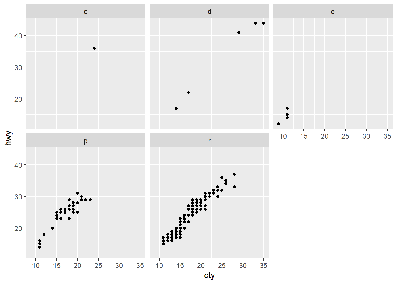
Faceting
# Faceting <- ggplot (mpg, aes (cty, hwy)) + geom_point ()+ facet_grid (. ~ fl)# facet into columns based on fl + facet_grid (year ~ .)# facet into rows based on year + facet_grid (year ~ fl)# facet into both rows and columns + facet_wrap (~ fl)# wrap facets into a rectangular layout
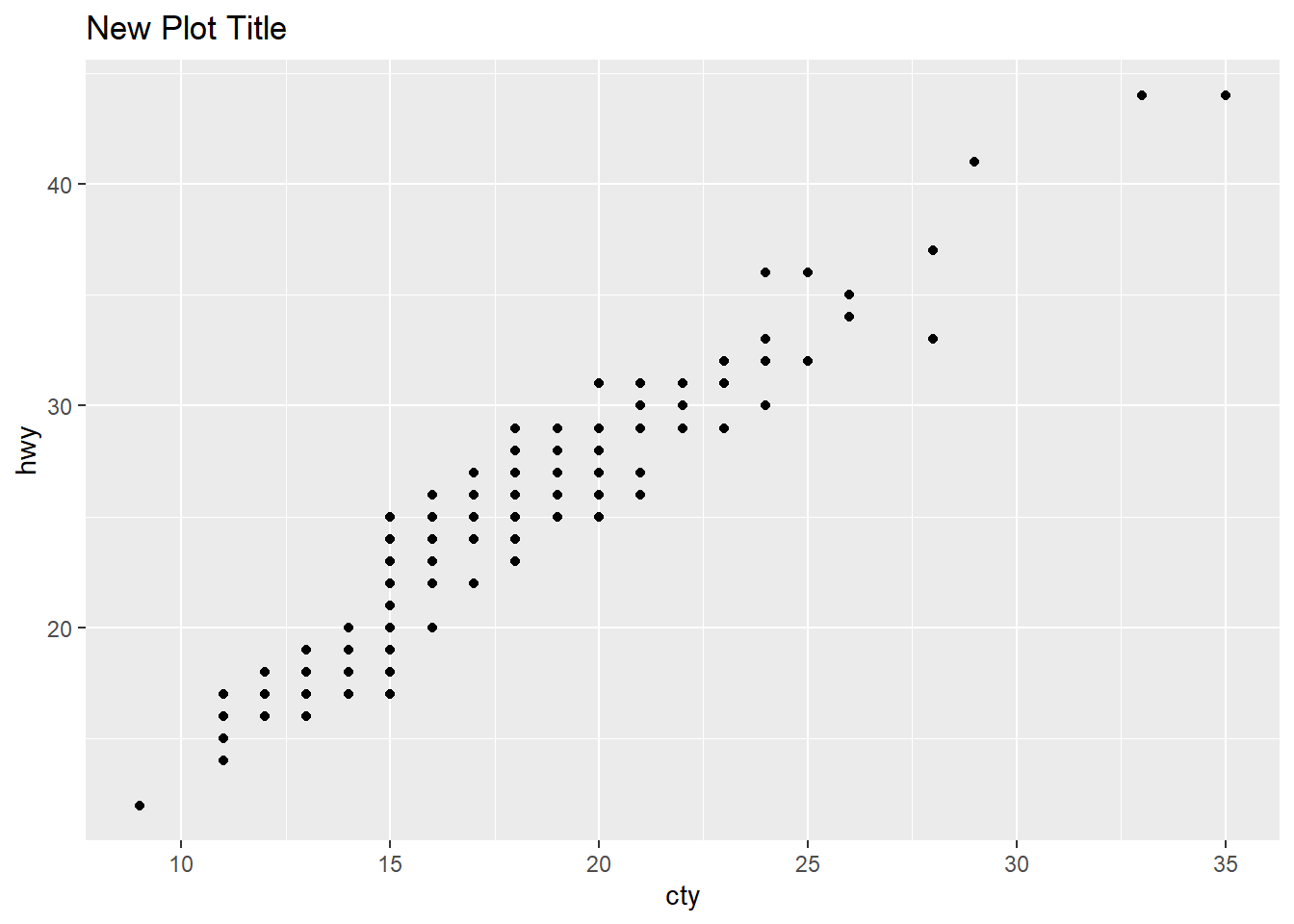
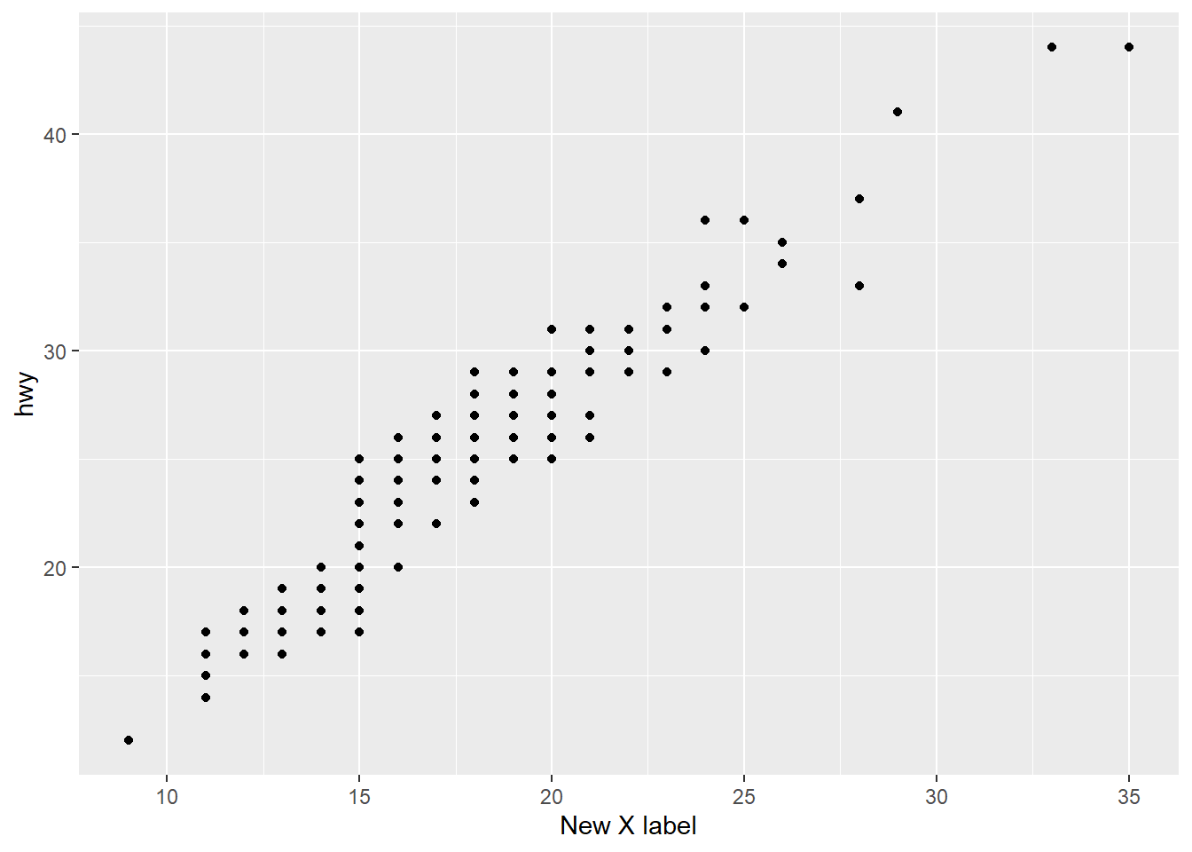
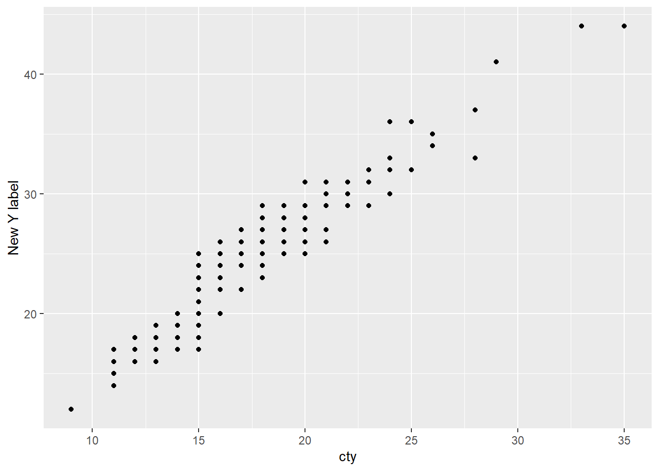
Labels
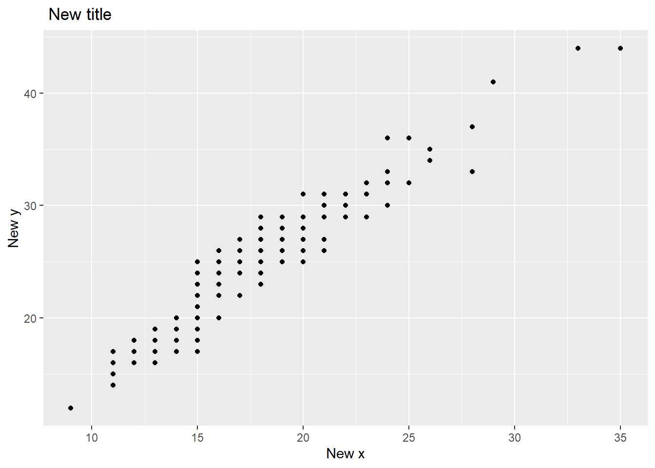
# Labels + ggtitle ("New Plot Title " )# Add a main title above the plot + xlab ("New X label" )# Change the label on the X axis + ylab ("New Y label" )# Change the label on the Y axis + labs (title = " New title" , x = "New x" , y = "New y" )
Qz
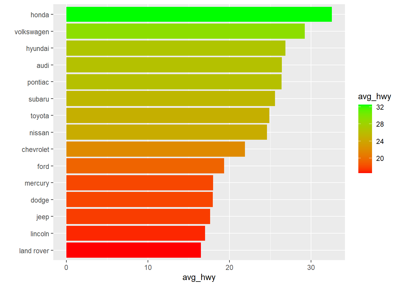
Question: Using the mpg
Hint: Use dplyrggplot2group_by()summarise()arrange()aes()geom_bar()coord_flip()scale_fill_gradient()