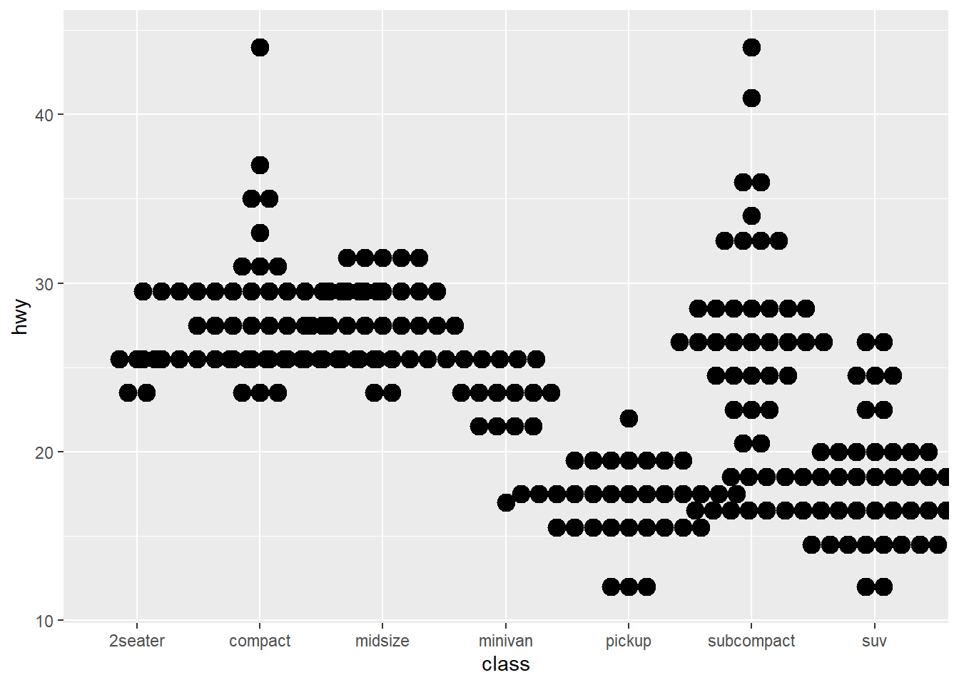
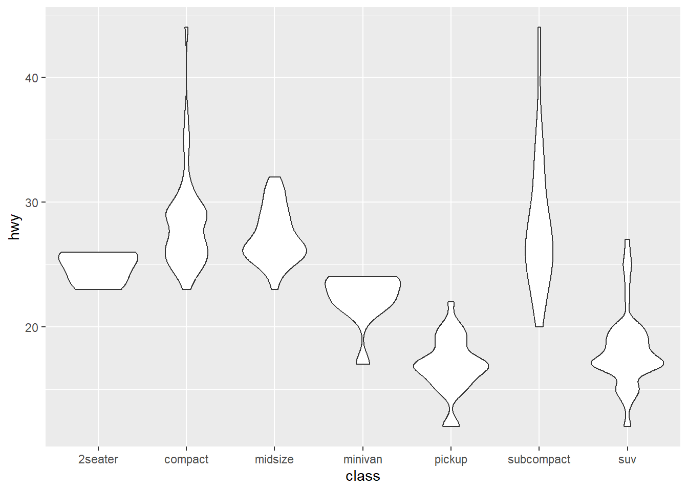
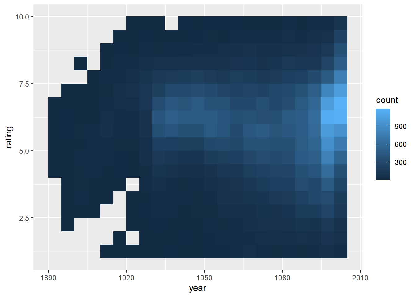
Data Visualization (2)

Advanced topics in viz

Weekly design


Pre-class video


Data visualization (2)


library(tidyverse)
── Attaching core tidyverse packages ──────────────────────── tidyverse 2.0.0 ──
✔ dplyr     1.1.4     ✔ readr     2.1.5
✔ forcats   1.0.0     ✔ stringr   1.5.1
✔ ggplot2   3.5.1     ✔ tibble    3.2.1
✔ lubridate 1.9.3     ✔ tidyr     1.3.1
✔ purrr     1.0.2     
── Conflicts ────────────────────────────────────────── tidyverse_conflicts() ──
✖ dplyr::filter() masks stats::filter()
✖ dplyr::lag()    masks stats::lag()
ℹ Use the conflicted package (<http://conflicted.r-lib.org/>) to force all conflicts to become errors
library(gapminder)


# 03 Visualization Tool

head(cars)
  speed dist
1     4    2
2     4   10
3     7    4
4     7   22
5     8   16
6     9   10
# type="p" is the point plot, main="cars" is the title of the graph
plot(cars, type = "p", main = "cars")

plot(cars, type = "l", main = "cars") # type ="l" is a plot using lines

plot(cars, type="b", main="cars") # type="b" is a plot using both points and lines

plot(cars, type = "h", main = "cars") # type = "h" is a bar graph such as a histogram

x = gapminder %>% filter(year == 1952 & continent == "Asia") %>% mutate(gdp = gdpPercap*pop) %>% select(country, gdp) %>% arrange(desc(gdp)) %>% head()
pie(x$gdp, x$country)

barplot(x$gdp, names.arg = x$country)

x = gapminder %>% filter(year == 2007 & continent == "Asia") %>% mutate(gdp = gdpPercap*pop) %>% select(country, gdp) %>% arrange(desc(gdp)) %>% head()
pie(x$gdp, x$country)

barplot(x$gdp, names.arg = x$country)

matplot(iris[, 1:4], type = "l")
legend("topleft", names(iris)[1:4], lty = c(1, 2, 3, 4), col = c(1, 2, 3, 4))

hist(cars$speed)

ggplot(gapminder, aes(x = gdpPercap, y = lifeExp, col = continent)) + geom_point(alpha = 0.2)

gapminder %>% filter(lifeExp>70) %>%
   group_by(continent) %>%
   summarize(n = n_distinct(country)) %>%
   ggplot(aes(x = continent, y = n)) +
   geom_bar(stat = "identity")

gapminder %>% filter(year == 2007) %>%
   ggplot(aes(lifeExp, col = continent)) +
   geom_histogram()
`stat_bin()` using `bins = 30`. Pick better value with `binwidth`.

gapminder %>% filter(year == 2007) %>%
   ggplot(aes(lifeExp, col = continent)) +
   geom_histogram(position = "dodge")
`stat_bin()` using `bins = 30`. Pick better value with `binwidth`.

gapminder %>%
   filter(year == 2007) %>%
   ggplot(aes(continent, lifeExp, col = continent)) +
   geom_boxplot()

ggplot(gapminder, aes(x = gdpPercap, y = lifeExp, col = continent)) +
   geom_point(alpha = 0.2)

ggplot(gapminder, aes(x = gdpPercap, y = lifeExp, col = continent)) +
   geom_point(alpha = 0.2) + scale_x_log10() # Convert the horizontal axis to log scale.

gapminder %>%
   filter(continent == "Africa") %>%
   ggplot(aes(country, lifeExp)) +
   geom_bar(stat = "identity") # [Figure 6-35(a)]

gapminder %>%
   filter(continent == "Africa") %>%
   ggplot(aes(country, lifeExp)) +
   geom_bar(stat = "identity") +
   coord_flip() # [Figure 6-35(b)] Switches the direction of the plot.

# install.packages("RColorBrewer")
library(RColorBrewer)

display.brewer.all()

# [Figure 6-37(a)]: Graph with basic palette applied
gapminder %>% filter(lifeExp>70) %>%
   group_by(continent) %>%
   summarize(n = n_distinct(country)) %>%
   ggplot(aes(x = continent, y = n)) +
   geom_bar(stat = "identity", aes(fill = continent))

# [Figure 6-37(b)]: Graph applying the Spectral palette
gapminder %>%
   filter(lifeExp>70) %>%
   group_by(year, continent) %>%
   summarize(n = n_distinct(country)) %>%
   ggplot(aes(x = continent, y = n)) +
   geom_bar(stat = "identity", aes(fill = continent)) + 
  scale_fill_brewer(palette = "Spectral")
`summarise()` has grouped output by 'year'. You can override using the
`.groups` argument.

help(geom_bar)
starting httpd help server ... done
# [Figure 6-37(c)] Graph applying the Blues palette
gapminder %>%
   filter(lifeExp>70) %>%
   group_by(continent) %>%
   summarize(n = n_distinct(country)) %>%
   ggplot(aes(x = continent, y = n)) +
   geom_bar(stat = "identity", aes(fill = continent)) + scale_fill_brewer(palette = "Blues")

# [Figure 6-37(d)] Graph applying the Oranges palette
gapminder %>%
   filter(lifeExp>70) %>%
   group_by(continent) %>%
   summarize(n = n_distinct(country)) %>%
   ggplot(aes(x = continent, y = n)) +
   geom_bar(stat = "identity", aes(fill = continent)) + scale_fill_brewer(palette = "Oranges")

# reorder(continent, -n) means sort the continents in descending order based on n
gapminder %>%
   filter(lifeExp >70) %>%
   group_by(continent) %>%
   summarize(n = n_distinct(country)) %>%
   ggplot(aes(x = reorder(continent, -n), y = n)) +
   geom_bar(stat = "identity", aes(fill = continent)) +
   scale_fill_brewer(palette = "Blues")

# Training!!
gapminder %>%
   filter(continent == "Africa", year==2007) %>%
   ggplot(aes(reorder(country, lifeExp), lifeExp, fill=lifeExp)) +
   geom_bar(stat = "identity") +
   coord_flip()

#
gapminder %>%
   filter(continent == "Africa", year==2007) %>%
   ggplot(aes(reorder(country, lifeExp), lifeExp, fill=lifeExp)) +
   geom_bar(stat = "identity") +
   coord_flip() +
   scale_fill_distiller(palette = "Oranges", direction=1)

# 04 Data exploration using visualization #

gapminder %>% ggplot(aes(gdpPercap, lifeExp, col = continent)) + geom_point(alpha = 0.2) + facet_wrap(~year) + scale_x_log10()

gapminder %>% filter(year == 1952 & gdpPercap > 10000 & continent == "Asia")
# A tibble: 1 × 6
  country continent  year lifeExp    pop gdpPercap
  <fct>   <fct>     <int>   <dbl>  <int>     <dbl>
1 Kuwait  Asia       1952    55.6 160000   108382.
gapminder %>% filter(country == "Kuwait") %>% ggplot(aes(year, gdpPercap)) + geom_point() + geom_line() # [Figure 6-40(a)]

gapminder %>% filter(country == "Kuwait") %>% ggplot(aes(year, pop)) + geom_point() + geom_line() # [Figure 6-40(b)]

gapminder %>% filter(country == "Korea, Rep.") %>% ggplot(aes(year, gdpPercap)) + geom_point() + geom_line() # [Figure 6-41(a)]

gapminder %>% filter(country == "Korea, Rep.") %>% ggplot(aes(year, pop)) + geom_point() + geom_line() # [Figure 6-41(b)]

gapminder %>% filter(country == "Kuwait" | country == "Korea, Rep.") %>% mutate(gdp = gdpPercap*pop) %>% ggplot(aes(year, gdp, col = country)) + geom_point() + geom_line()

# [Figure 6-43(a)] Comparison of changes in gdpPercap
gapminder %>% filter(country == "Kuwait"|country == "Saudi Arabia"|country == "Iraq"|country == "Iran"|country == "Korea, Rep."|country == "China "|country == "Japan") %>% ggplot(aes(year, gdpPercap, col = country)) + geom_point() + geom_line()

# [Figure 6-43(b)] Comparison of changes in pop
gapminder %>% filter(country == "Kuwait"|country=="Saudi Arabia"|country == "Iraq"|country == "Iran"|country == "Korea, Rep."|country == "China "|country == "Japan") %>% ggplot(aes(year, pop, col=country)) + geom_point() + geom_line()

# [Figure 6-43(c)] Comparison of changes in gdp
gapminder %>% filter(country == "Kuwait"|country == "Saudi Arabia"|country == "Iraq"|country == "Iran"|country == "Korea, Rep."|country == "China "|country == "Japan") %>% mutate(gdp=gdpPercap*pop) %>% ggplot(aes(year, gdp, col = country)) + geom_point() + geom_line() + scale_y_log10()

Class


Review for ggplot2 library


library(tidyverse)

mpg %>% select(hwy, cty, cyl)
# A tibble: 234 × 3
     hwy   cty   cyl
   <int> <int> <int>
 1    29    18     4
 2    29    21     4
 3    31    20     4
 4    30    21     4
 5    26    16     6
 6    26    18     6
 7    27    18     6
 8    26    18     4
 9    25    16     4
10    28    20     4
# ℹ 224 more rows
ggplot(mpg, aes(hwy, cty)) +
  geom_point(aes(color = as.factor(cyl)))

ggplot(mpg, aes(hwy, cty)) +
  geom_point(aes(color = as.factor(cyl))) +
  geom_smooth(method ="lm")
`geom_smooth()` using formula = 'y ~ x'

ggplot(mpg, aes(hwy, cty)) +
  geom_point(aes(color = as.factor(cyl))) +
  geom_smooth(method ="glm")
`geom_smooth()` using formula = 'y ~ x'

ggplot(mpg, aes(hwy, cty)) +
  geom_point(aes(color = cyl)) +
  geom_smooth(method ="lm") +
  # coord_cartesian() +
  # scale_color_gradient() +
  theme_bw()
`geom_smooth()` using formula = 'y ~ x'

# Returns the last plot
last_plot()
`geom_smooth()` using formula = 'y ~ x'

# Saves last plot as 5’ x 5’ file named "plot.png" in
# working directory. Matches file type to file extension.
# ggsave("plot.png", width = 5, height = 5)

One variable

# Continuous
a <- ggplot(mpg, aes(hwy))
a

a + geom_area(stat = "bin")
`stat_bin()` using `bins = 30`. Pick better value with `binwidth`.

a + geom_density(kernel = "gaussian")

a + geom_dotplot()
Bin width defaults to 1/30 of the range of the data. Pick better value with
`binwidth`.

a + geom_freqpoly()
`stat_bin()` using `bins = 30`. Pick better value with `binwidth`.

a + geom_histogram(binwidth = 4)

mpg %>% ggplot()+
  geom_area(aes(hwy), stat="bin")
`stat_bin()` using `bins = 30`. Pick better value with `binwidth`.

# Discrete
b <- ggplot(mpg, aes(fl))
b + geom_bar()

# Two variables
# Continuous X & Countinuous Y
f <- ggplot(mpg, aes(cty, hwy))
f + geom_blank()

f + geom_jitter()

f + geom_point()

# install.packages("quantreg")
library(quantreg)
Loading required package: SparseM

Attaching package: 'SparseM'
The following object is masked from 'package:base':

    backsolve
f + geom_quantile() + geom_jitter()
Smoothing formula not specified. Using: y ~ x

f + geom_rug(sides = "bl") + geom_jitter()

f + geom_rug(sides = "bl") + geom_point()

f + geom_smooth(model = lm) +  geom_point()
Warning in geom_smooth(model = lm): Ignoring unknown parameters: `model`
`geom_smooth()` using method = 'loess' and formula = 'y ~ x'

f + geom_text(aes(label = cty)) + 
  geom_jitter()

f + geom_text(aes(label = fl))

mpg %>% 
  ggplot(aes(cty, hwy, label = fl, 
             alpha=0.1, col='red')) +
  geom_text()+
  geom_jitter()

# install.packages("ggimage")
library(ggimage)

img <- list.files(system.file("extdata", 
                              package="ggimage"),
                  pattern="png", full.names=TRUE)

img[2]
[1] "C:/R/R-4.4.0/library/ggimage/extdata/Rlogo.png"
f + geom_image(aes(image=img[2]))

# Discrete X & Countinuous Y
g <- ggplot(mpg, aes(class, hwy))
levels(as.factor(mpg$class))
[1] "2seater"    "compact"    "midsize"    "minivan"    "pickup"    
[6] "subcompact" "suv"       
str(mpg$class)
 chr [1:234] "compact" "compact" "compact" "compact" "compact" "compact" ...
levels(as.factor(mpg$class))
[1] "2seater"    "compact"    "midsize"    "minivan"    "pickup"    
[6] "subcompact" "suv"       
unique(mpg$class)
[1] "compact"    "midsize"    "suv"        "2seater"    "minivan"   
[6] "pickup"     "subcompact"
mpg %>% count(class)
# A tibble: 7 × 2
  class          n
  <chr>      <int>
1 2seater        5
2 compact       47
3 midsize       41
4 minivan       11
5 pickup        33
6 subcompact    35
7 suv           62
mpg %>% select(manufacturer, class, hwy) %>% 
  group_by(class) %>% 
  arrange(desc(hwy)) %>% head(10) -> dkdk
mpg %>% count(class)
# A tibble: 7 × 2
  class          n
  <chr>      <int>
1 2seater        5
2 compact       47
3 midsize       41
4 minivan       11
5 pickup        33
6 subcompact    35
7 suv           62
g

g + geom_bar(stat = "identity")

g + geom_boxplot()

g + geom_dotplot(binaxis = "y",
                 stackdir = "center")
Bin width defaults to 1/30 of the range of the data. Pick better value with
`binwidth`.

g + geom_violin(scale = "area")

# Discrete X & Discrete Y
diamonds
# A tibble: 53,940 × 10
   carat cut       color clarity depth table price     x     y     z
   <dbl> <ord>     <ord> <ord>   <dbl> <dbl> <int> <dbl> <dbl> <dbl>
 1  0.23 Ideal     E     SI2      61.5    55   326  3.95  3.98  2.43
 2  0.21 Premium   E     SI1      59.8    61   326  3.89  3.84  2.31
 3  0.23 Good      E     VS1      56.9    65   327  4.05  4.07  2.31
 4  0.29 Premium   I     VS2      62.4    58   334  4.2   4.23  2.63
 5  0.31 Good      J     SI2      63.3    58   335  4.34  4.35  2.75
 6  0.24 Very Good J     VVS2     62.8    57   336  3.94  3.96  2.48
 7  0.24 Very Good I     VVS1     62.3    57   336  3.95  3.98  2.47
 8  0.26 Very Good H     SI1      61.9    55   337  4.07  4.11  2.53
 9  0.22 Fair      E     VS2      65.1    61   337  3.87  3.78  2.49
10  0.23 Very Good H     VS1      59.4    61   338  4     4.05  2.39
# ℹ 53,930 more rows
h <- ggplot(diamonds, aes(cut, color))
h + geom_jitter()

# Continuous Bivariate Distribution
# install.packages("ggplot2movies")
library(ggplot2movies)

movies %>% glimpse
Rows: 58,788
Columns: 24
$ title       <chr> "$", "$1000 a Touchdown", "$21 a Day Once a Month", "$40,0…
$ year        <int> 1971, 1939, 1941, 1996, 1975, 2000, 2002, 2002, 1987, 1917…
$ length      <int> 121, 71, 7, 70, 71, 91, 93, 25, 97, 61, 99, 96, 10, 10, 10…
$ budget      <int> NA, NA, NA, NA, NA, NA, NA, NA, NA, NA, NA, NA, NA, NA, NA…
$ rating      <dbl> 6.4, 6.0, 8.2, 8.2, 3.4, 4.3, 5.3, 6.7, 6.6, 6.0, 5.4, 5.9…
$ votes       <int> 348, 20, 5, 6, 17, 45, 200, 24, 18, 51, 23, 53, 44, 11, 12…
$ r1          <dbl> 4.5, 0.0, 0.0, 14.5, 24.5, 4.5, 4.5, 4.5, 4.5, 4.5, 4.5, 4…
$ r2          <dbl> 4.5, 14.5, 0.0, 0.0, 4.5, 4.5, 0.0, 4.5, 4.5, 0.0, 0.0, 0.…
$ r3          <dbl> 4.5, 4.5, 0.0, 0.0, 0.0, 4.5, 4.5, 4.5, 4.5, 4.5, 4.5, 4.5…
$ r4          <dbl> 4.5, 24.5, 0.0, 0.0, 14.5, 14.5, 4.5, 4.5, 0.0, 4.5, 14.5,…
$ r5          <dbl> 14.5, 14.5, 0.0, 0.0, 14.5, 14.5, 24.5, 4.5, 0.0, 4.5, 24.…
$ r6          <dbl> 24.5, 14.5, 24.5, 0.0, 4.5, 14.5, 24.5, 14.5, 0.0, 44.5, 4…
$ r7          <dbl> 24.5, 14.5, 0.0, 0.0, 0.0, 4.5, 14.5, 14.5, 34.5, 14.5, 24…
$ r8          <dbl> 14.5, 4.5, 44.5, 0.0, 0.0, 4.5, 4.5, 14.5, 14.5, 4.5, 4.5,…
$ r9          <dbl> 4.5, 4.5, 24.5, 34.5, 0.0, 14.5, 4.5, 4.5, 4.5, 4.5, 14.5,…
$ r10         <dbl> 4.5, 14.5, 24.5, 45.5, 24.5, 14.5, 14.5, 14.5, 24.5, 4.5, …
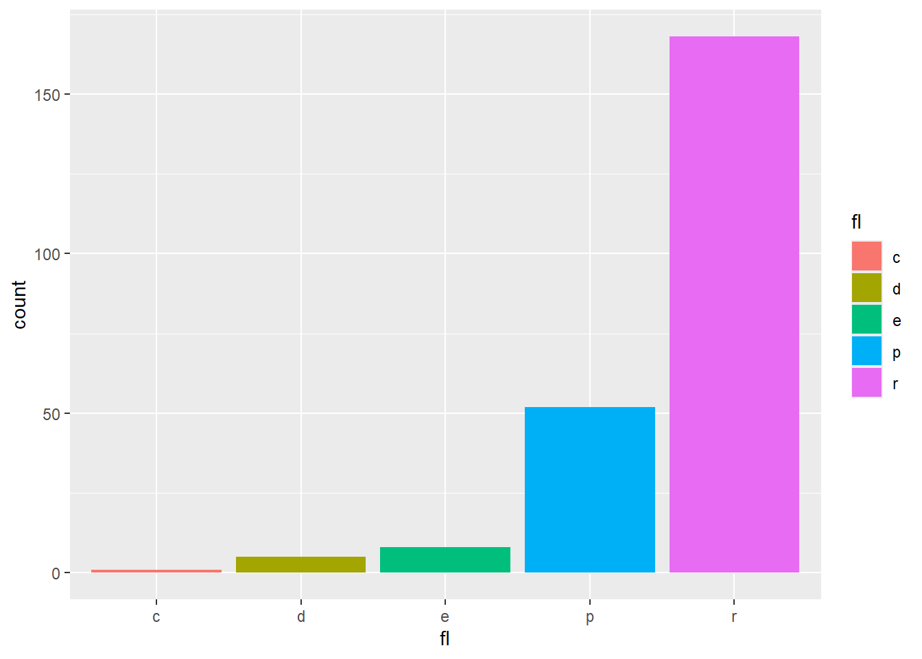
$ mpaa        <chr> "", "", "", "", "", "", "R", "", "", "", "", "", "", "", "…
$ Action      <int> 0, 0, 0, 0, 0, 0, 1, 0, 0, 0, 0, 0, 0, 0, 1, 1, 0, 0, 1, 0…
$ Animation   <int> 0, 0, 1, 0, 0, 0, 0, 0, 0, 0, 0, 0, 0, 0, 0, 0, 0, 0, 0, 1…
$ Comedy      <int> 1, 1, 0, 1, 0, 0, 0, 0, 0, 0, 0, 0, 1, 0, 1, 1, 0, 0, 1, 1…
$ Drama       <int> 1, 0, 0, 0, 0, 1, 1, 0, 1, 0, 1, 0, 0, 0, 0, 0, 1, 0, 0, 0…
$ Documentary <int> 0, 0, 0, 0, 0, 0, 0, 1, 0, 0, 0, 0, 0, 0, 0, 0, 0, 1, 0, 0…
$ Romance     <int> 0, 0, 0, 0, 0, 0, 0, 0, 0, 0, 0, 0, 0, 0, 0, 0, 0, 0, 0, 0…
$ Short       <int> 0, 0, 1, 0, 0, 0, 0, 1, 0, 0, 0, 0, 1, 1, 0, 0, 0, 1, 0, 1…
i <- ggplot(movies, aes(year, rating))
i + geom_bin2d(binwidth = c(5, 0.5))

i + geom_density2d()

# install.packages("hexbin")
library(hexbin)
i + geom_hex()

# Continuous Function
j <- ggplot(economics, aes(date, unemploy))
j + geom_area()

j + geom_line()

j + geom_step(direction = "hv")

# Visualizing error
df <- data.frame(grp = c("A", "B"), fit = 4:5, se = 1:2)
k <- ggplot(df, 
            aes(grp, fit, 
                ymin = fit-se, 
                ymax = fit+se))

k + geom_crossbar(fatten = 2)

k + geom_errorbar(col="grey") +
  geom_point(aes(col="red")) 

k + geom_linerange()

k + geom_pointrange()

# Three variables
?seals
seals$z <- with(seals, sqrt(delta_long^2 + delta_lat^2))
m <- ggplot(seals, aes(long, lat))

m + geom_tile(aes(fill = z))

m + geom_contour(aes(z = z))

m + geom_raster(aes(fill = z), hjust=0.5,
                vjust=0.5, interpolate=FALSE)

# Scales
n <- b + geom_bar(aes(fill = fl))
n

n + scale_fill_manual(
  values = c("skyblue", "royalblue", "blue", "navy"),
  limits = c("d", "e", "p", "r"), breaks =c("d", "e", "p", "r"),
  name = "Fuel", labels = c("D", "E", "P", "R"))

# Color and fill scales
n <- b + geom_bar(aes(fill = fl))
o <- a + geom_dotplot(aes(fill = ..x..))
# install.packages("RColorBrewer")
library(RColorBrewer)

n + scale_fill_brewer(palette = "Blues")

display.brewer.all()

n + scale_fill_grey(
  start = 0.2, end = 0.8,
  na.value = "red")

o + scale_fill_gradient(
  low = "red",
  high = "yellow")
Warning: The dot-dot notation (`..x..`) was deprecated in ggplot2 3.4.0.
ℹ Please use `after_stat(x)` instead.
Bin width defaults to 1/30 of the range of the data. Pick better value with
`binwidth`.

o + scale_fill_gradientn(
  colours = terrain.colors(5))
Bin width defaults to 1/30 of the range of the data. Pick better value with
`binwidth`.

# Also: rainbow(), heat.colors(),
# topo.colors(), cm.colors(),
# RColorBrewer::brewer.pal()
# Shape scales
f

p <- f + geom_point(aes(shape = fl))
p

p + scale_shape(solid = FALSE)

p + scale_shape_manual(values = c(3:7))

# Coordinate Systems
r <- b+geom_bar()
r + coord_cartesian(xlim = c(0, 5))

r + coord_fixed(ratio = 1/2)

r + coord_fixed(ratio = 1/10)

r + coord_fixed(ratio = 1/100)

r + coord_flip()

r + coord_polar(theta = "x", direction=1 )

# Position Adjustments

s <- ggplot(mpg, aes(fl, fill = drv))

s + geom_bar(position = "dodge")

# Arrange elements side by side
s + geom_bar(position = "fill")

# Stack elements on top of one another, normalize height
s + geom_bar(position = "stack")

# Stack elements on top of one another
f + geom_point(position = "jitter")

# Add random noise to X and Y position of each element to avoid overplotting
# Theme
r + theme_bw()

r + theme_classic()

r + theme_grey()

r + theme_minimal()

# Faceting

t <- ggplot(mpg, aes(cty, hwy)) + geom_point()
t + facet_grid(. ~ fl)

t + facet_grid(fl ~ .)

# facet into columns based on fl
t + facet_grid(year ~ .)

# facet into rows based on year
t + facet_grid(year ~ fl)

# facet into both rows and columns
t + facet_wrap(~ fl)

# wrap facets into a rectangular layout
# Labels
t + ggtitle("New Plot Title ")

# Add a main title above the plot
t + xlab("New X label")

# Change the label on the X axis
t + ylab("New Y label")

# Change the label on the Y axis
t + labs(title =" New title", x = "New x", y = "New y")

# All of the above
mpg %>% 
  group_by(manufacturer) %>% 
  summarise(avg_hwy=mean(hwy)) %>% 
  arrange(desc(avg_hwy)) %>% 
  ggplot(aes(x=reorder(manufacturer, avg_hwy),
             y=avg_hwy,
             fill=avg_hwy))+
  scale_fill_gradient(
    low = "red",
    high = "green")+
  coord_flip()+
  geom_bar(stat='identity')+
  xlab("")+
  ggtitle("제조사별 평균 연비")