The following objects are masked from 'package:stats':

    filter, lag
The following objects are masked from 'package:base':

    intersect, setdiff, setequal, union
y <- gapminder %>%group_by(year, continent) %>%summarize(c_pop =sum(pop))
`summarise()` has grouped output by 'year'. You can override using the
`.groups` argument.
head(y, 20)
# A tibble: 20 × 3
# Groups:   year [4]
    year continent      c_pop
   <int> <fct>          <dbl>
 1  1952 Africa     237640501
 2  1952 Americas   345152446
 3  1952 Asia      1395357351
 4  1952 Europe     418120846
 5  1952 Oceania     10686006
 6  1957 Africa     264837738
 7  1957 Americas   386953916
 8  1957 Asia      1562780599
 9  1957 Europe     437890351
10  1957 Oceania     11941976
11  1962 Africa     296516865
12  1962 Americas   433270254
13  1962 Asia      1696357182
14  1962 Europe     460355155
15  1962 Oceania     13283518
16  1967 Africa     335289489
17  1967 Americas   480746623
18  1967 Asia      1905662900
19  1967 Europe     481178958
20  1967 Oceania     14600414
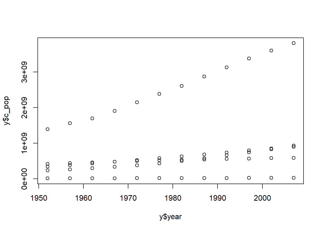
plot(y$year, y$c_pop)
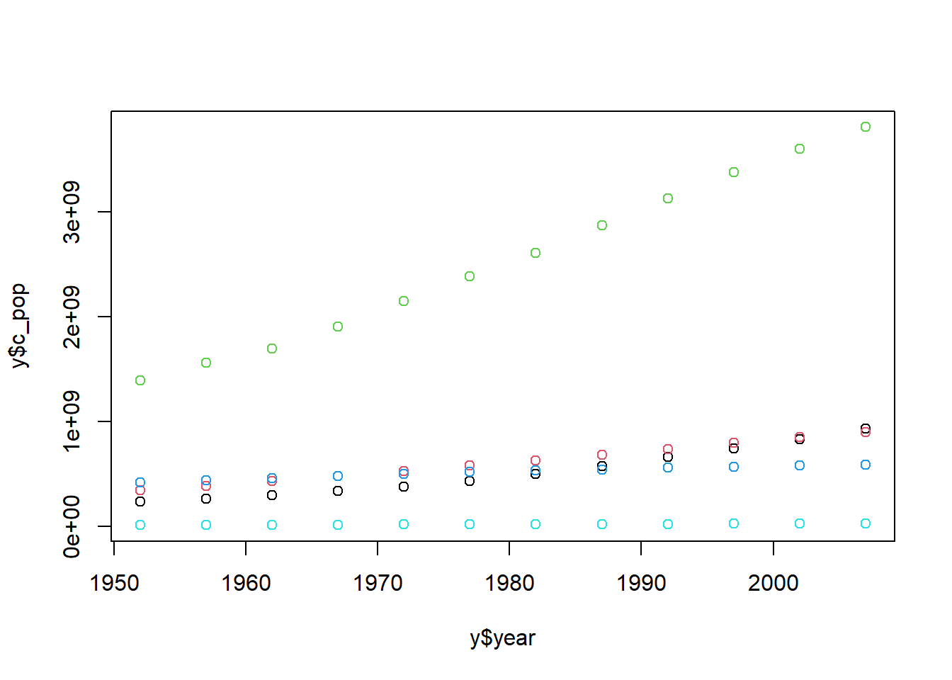
plot(y$year, y$c_pop, col = y$continent)
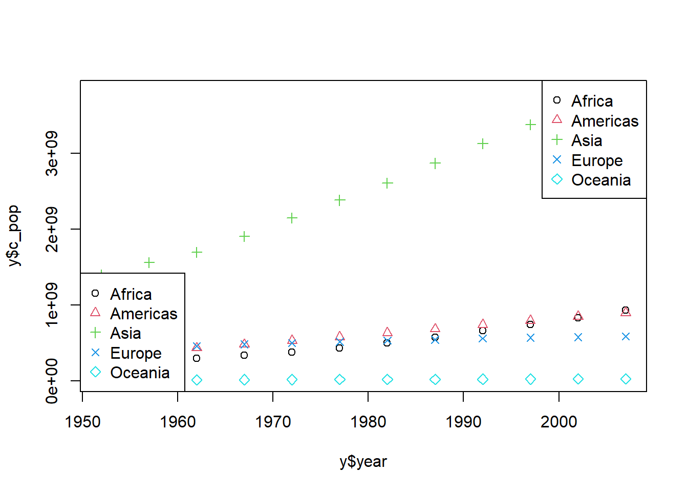
plot(y$year, y$c_pop, col = y$continent, pch =c(1:5))plot(y$year, y$c_pop, col = y$continent, pch =c(1:length(levels(y$continent))))# Specify the number of legends as a numberlegend("topright", legend =levels((y$continent)), pch =c(1:5), col =c(1:5))# Specify the number of legends to match the number of datalegend("bottomleft", legend =levels((y$continent)), pch =c(1:length(levels(y$continent))), col =c(1:length(levels(y$continent))) )
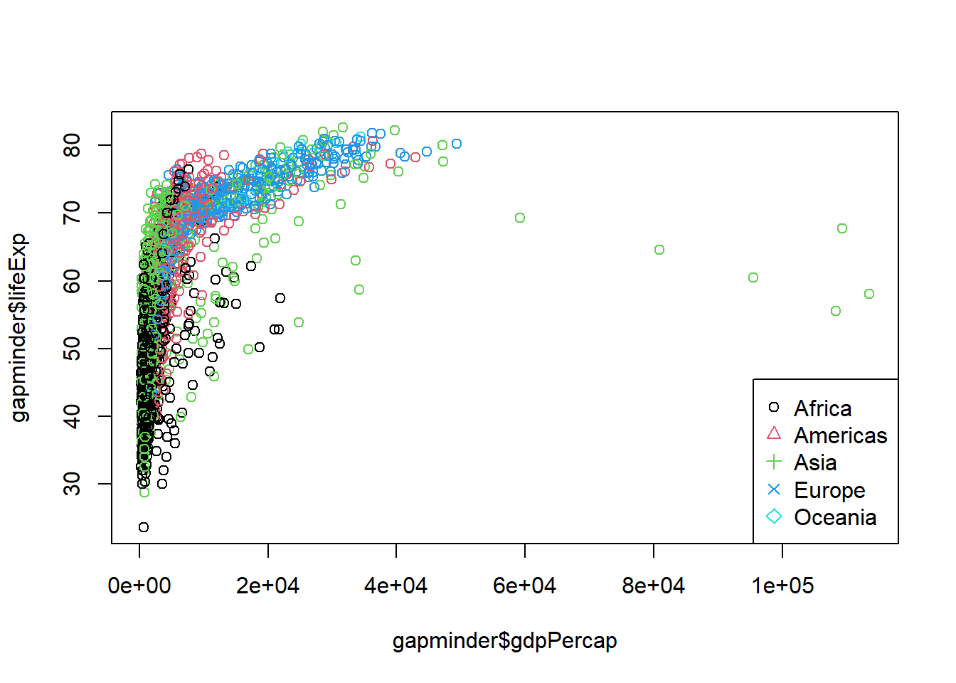
# 02 Basic features of visualization #plot(gapminder$gdpPercap, gapminder$lifeExp, col = gapminder$continent)legend("bottomright", legend =levels((gapminder$continent)),pch =c(1:length(levels(gapminder$continent))),col =c(1:length(levels(y$continent))))
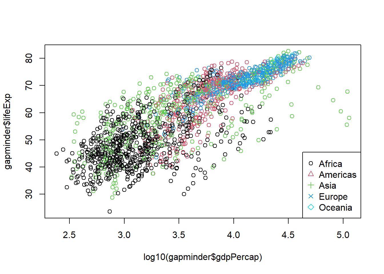
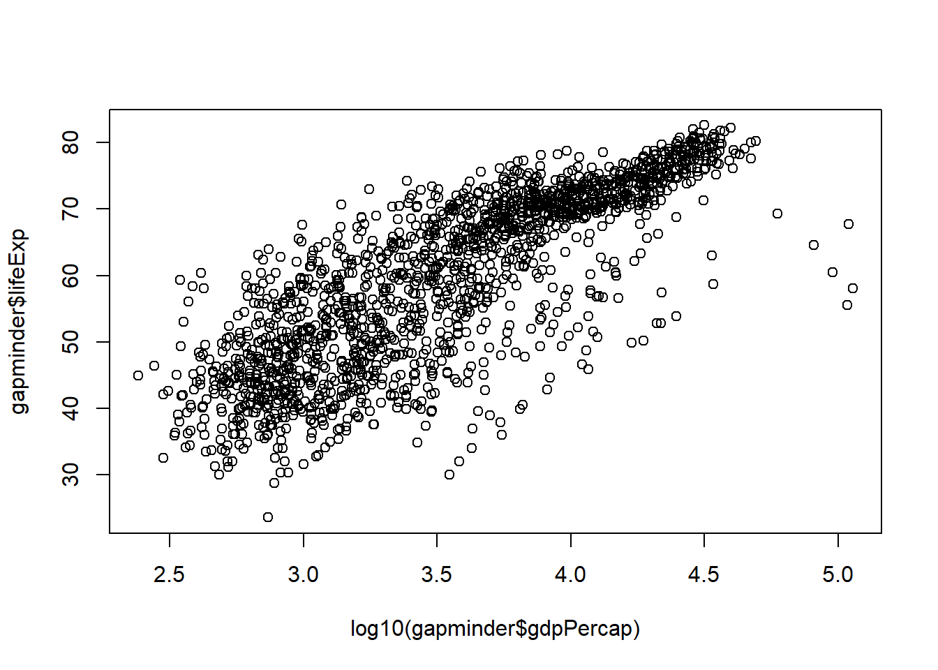
plot(log10(gapminder$gdpPercap), gapminder$lifeExp, col = gapminder$continent)legend("bottomright", legend =levels((gapminder$continent)), pch =c(1:length(levels(gapminder$continent))), col =c(1:length(levels(y$continent))) )
Data visualization is an essential skill in data science, helping to turn complex results into comprehensible insights. In R, one of the most powerful tools for creating professional and visually appealing graphs is ggplot2. This package, built on the principles of the Grammar of Graphics by Leland Wilkinson, allows users to create graphs that are both informative and attractive. Let’s delve into the concepts and practical applications of ggplot2 to enhance your data visualization skills.
Grammar of Graphics
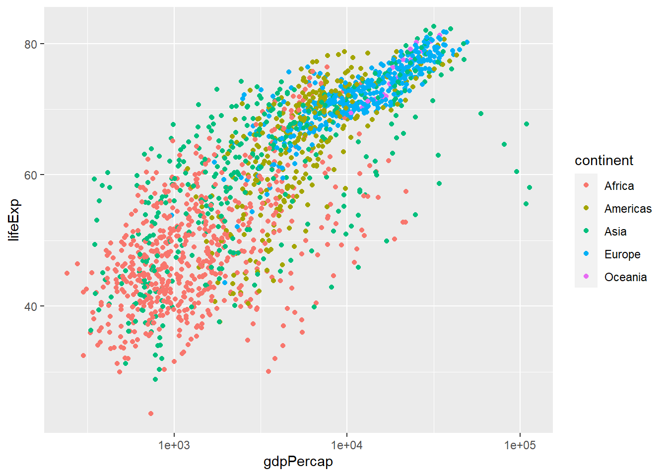
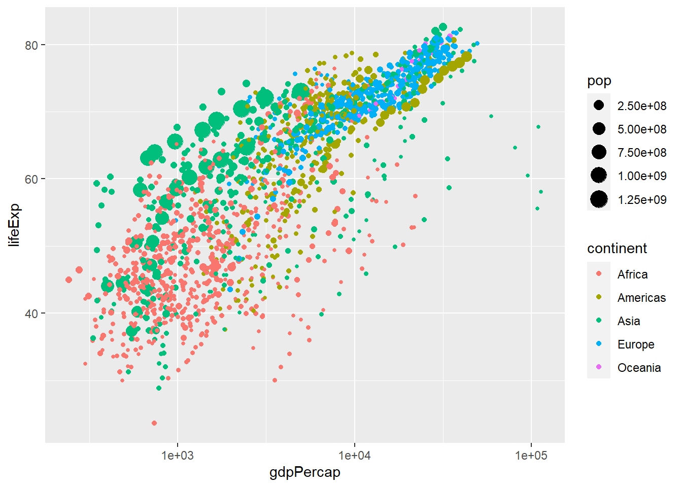
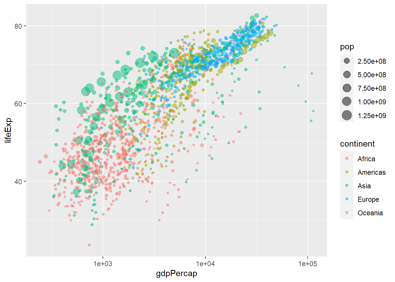
ggplot2 is a system for declaratively creating graphics, based on The Grammar of Graphics. You provide the data, tell ggplot2 how to map variables to aesthetics, what graphical primitives to use, and it takes care of the details.
At its core, ggplot2 operates on a coherent set of principles known as the “Grammar of Graphics.” This framework allows you to specify graphs in terms of their underlying components:
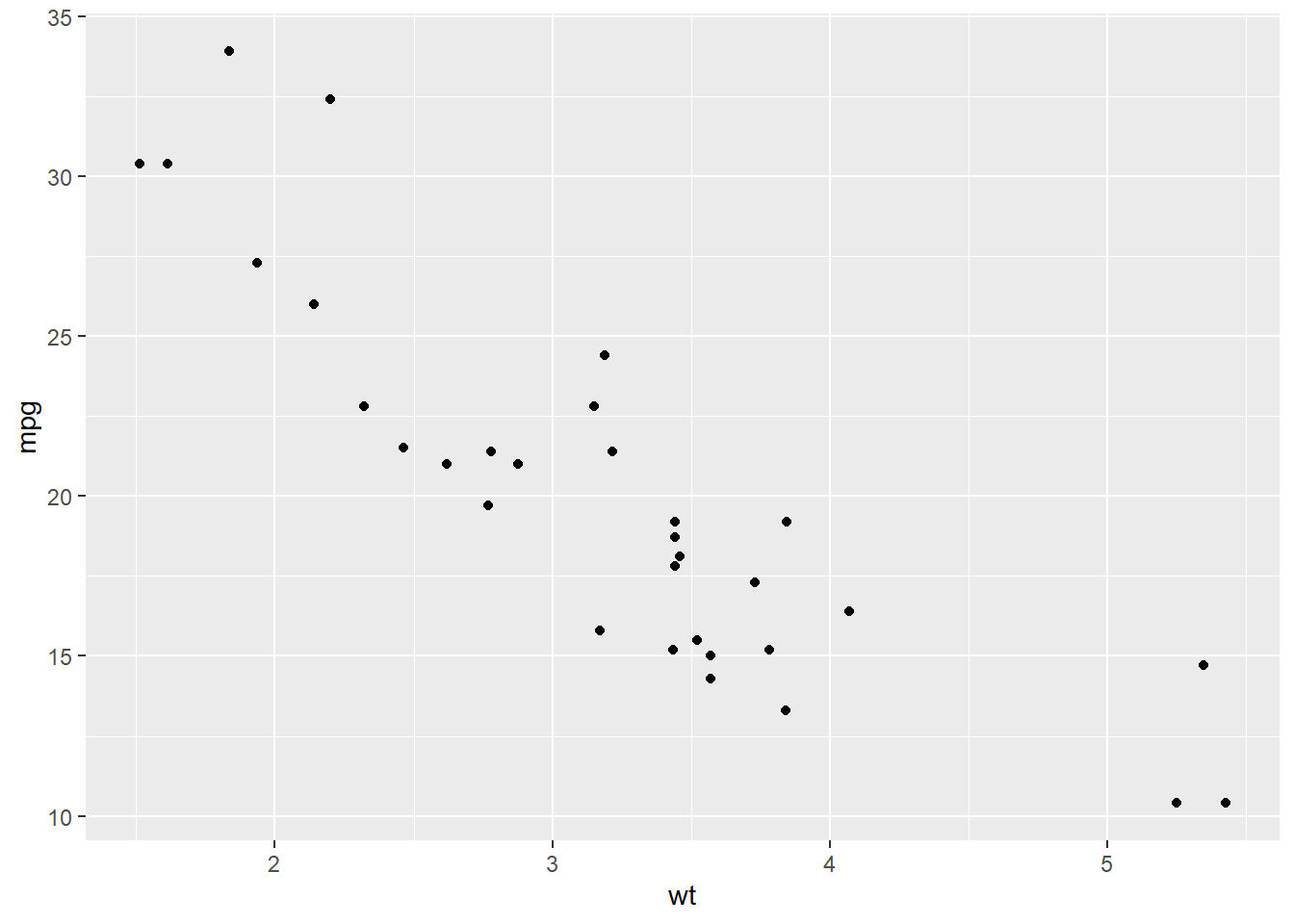
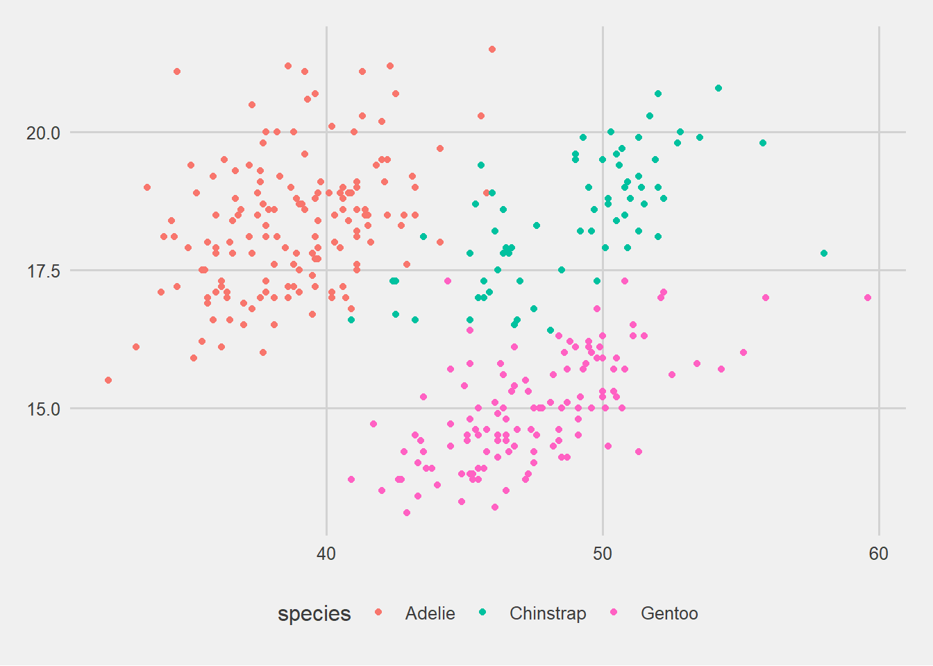
Aesthetics (aes): These define how data is mapped to visual properties like size, shape, and color.
Geoms (geometric objects): These are the actual visual elements that represent data—points, lines, bars, etc.
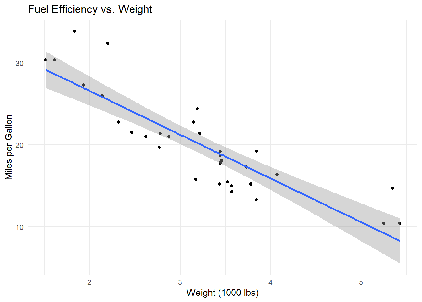
Stats (statistical transformations): Some plots require transformations, such as calculating means or fitting a regression line, which are handled by stats.
Scales: These control how data values are mapped to visual properties.
Coordinate systems: These define how plots are oriented, with Cartesian coordinates being the most common, but others like polar coordinates are available for specific needs.
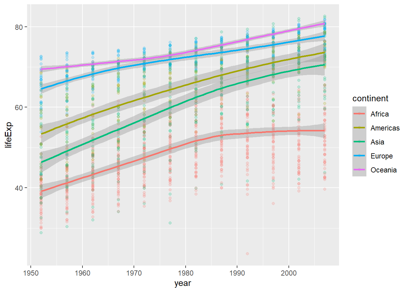
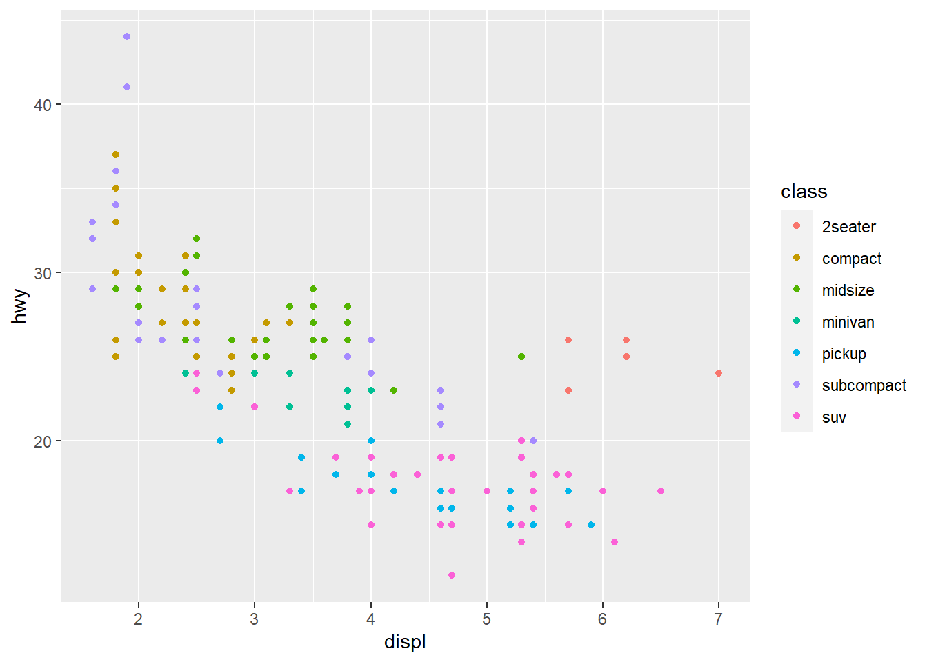
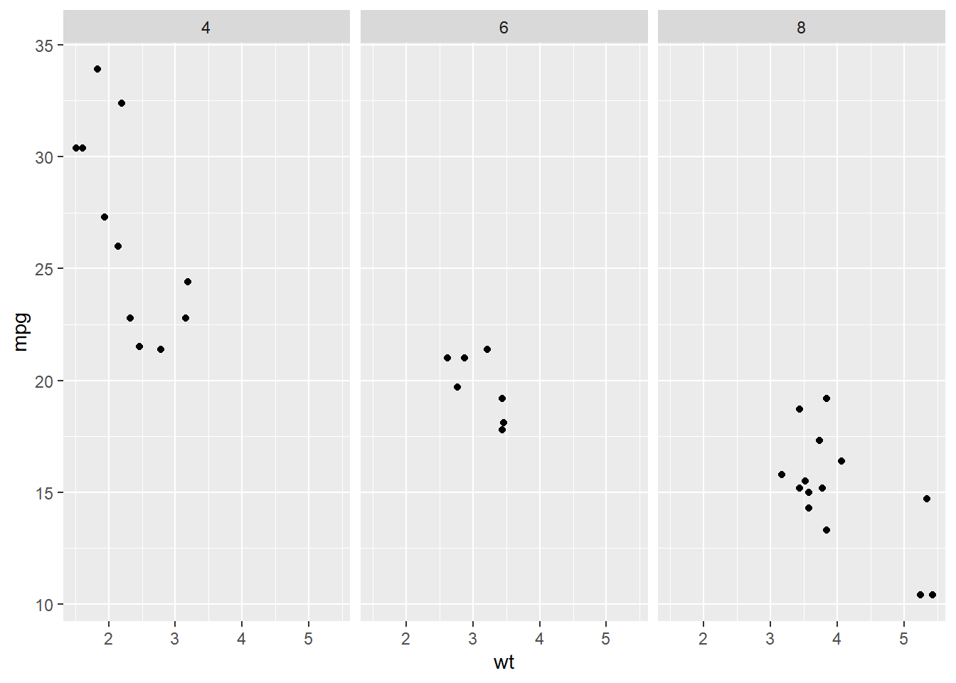
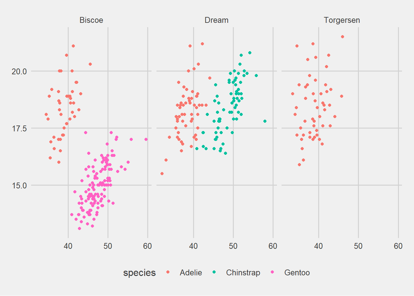
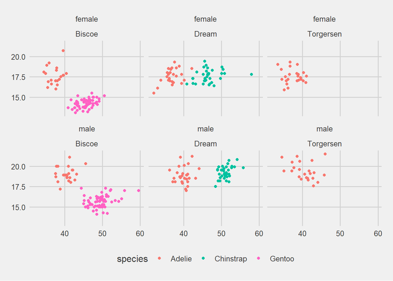
Facets: Faceting allows you to generate multiple plots based on a grouping variable, creating a matrix of panels.
ggplot2 is highly customizable, allowing extensive control over nearly every visual aspect of a plot. For users interested in making interactive plots, ggplot2 can be integrated with the plotly library, transforming static charts into interactive visualizations.
The power and flexibility of ggplot2 make it an indispensable tool for data visualization in R. Whether you are a beginner or an experienced user, there is always more to explore and learn with ggplot2. Practice regularly, and don’t hesitate to experiment with different components to discover the best ways to convey your insights visually.